00Brand directions, Rev 2 · Rick Underwood · 2026-10-07
I See You.
Brand Directions
Ten ideas across cover, interior, merch and the way readers stay connected.
Now clickable. Tap any cover, flip any tee, pick what you would buy, then cast your vote at the end.
01The brief
You asked for three things.
Branding. Merch. Ways for people to keep connecting.
The lens, in Rick's words
To be seen is to be alive. To be unseen is to be dead. Everyone human on planet earth shares one need. The need is to be seen and understood.
This book looks at the world through that lens. When the need is met, and when it goes unmet. It is the engine that runs our entire system.
The three ideas every direction has to carry
The wave. Seeing is energy. It does not divide, it multiplies. If equal waves meet exactly in step, the combined amplitude doubles.
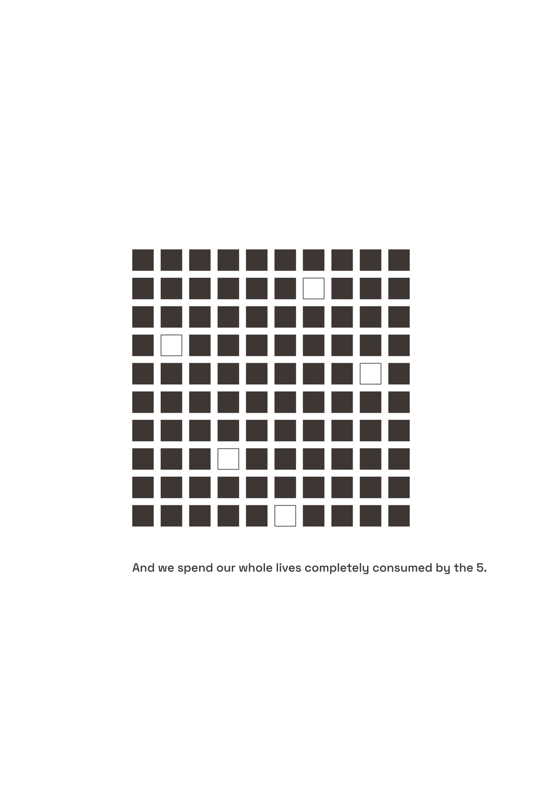
The 5% ask. If we all tried just 5% more to see one another, what could that do? The ask is the wave. It is never "we already have 95% of what we need." That line is a separate point about abundance and it is never fused with this one.
Two truths. You can be a good person and have done a bad thing. Your truth does not cancel another person's.
Anchor comp and the shelf
Frankl, Man's Search for Meaning. A wisdom book forged in near-death, one human drive, authority through restraint.
For readers of Brené Brown and Glennon Doyle, with the narrative pull of Greenlights. On the shelf: Frankl's quiet grounds and one small element; Greenlights' real photograph; Untamed's handmade texture; Atlas of the Heart's single illustrated idea. The 2026 line: typography as the image, one confident symbol, visible hand. A flat blue field with a glowing core sits on the wrong side of it.
The ask is not to be perfect. The ask is to accept that we are human and flawed, and to try.
02What already exists, and what we built on
The March guide set the palette and the type.
It also left six questions open.
White #FFFFFF · Light Gray #F3F4F6 · Blue #2563EB · Orange #F97316 · Black #111111
Space Grotesk display · Inter body · White and gray 60%, black 20%, blue 12%, orange 8%
Which blue#2563EB shown. Brighter, deeper, electric?
Which orange#F97316 shown. More coral, more amber?
The markOpen Aperture, two arcs, two colours. Geometric, organic, or hand-drawn?
White or blackClean and modern, or cinematic weight.
Gradient or dualFusion, or tension. The October 6 orange rule reopens this.
The subtitleOn the cover, or does the title stand alone?
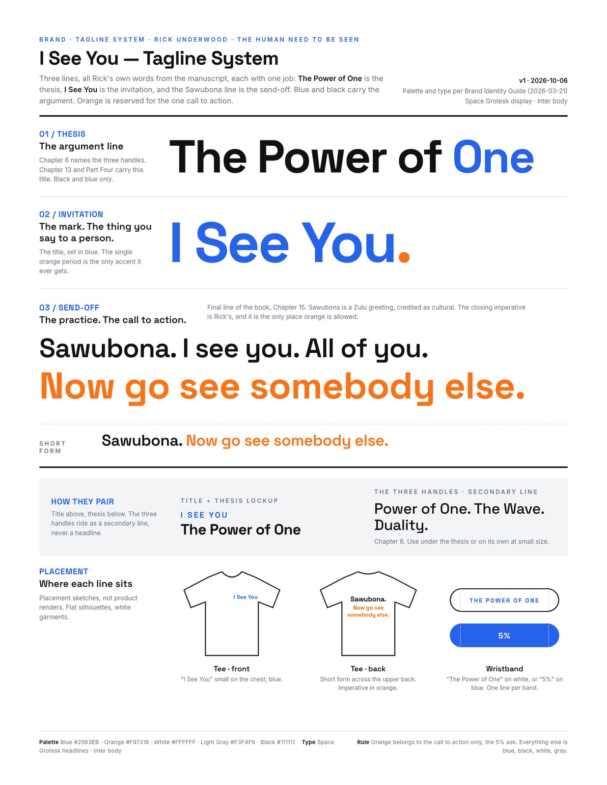
The Tagline System sheet (v1, 2026-10-06). Three lines, three jobs, and the orange rule that reshaped the cover problem.
The connection path we articulated today
PrintBook
Two QR pages, specified in the art map.
BuiltQuiz
How seen do you feel?
BuiltLetter
You are seen. Personalised, gated.
ProposedPractice
Go see somebody.
ProposedToken
Merch as the token of the practice.
03The tagline system
Three lines, all Rick's own words.
Each with one job.
01 / Thesis
The Power of One
The argument line. Chapter 6 names the three handles; Chapter 13 and Part Four carry this title. Black and blue only.
02 / Invitation
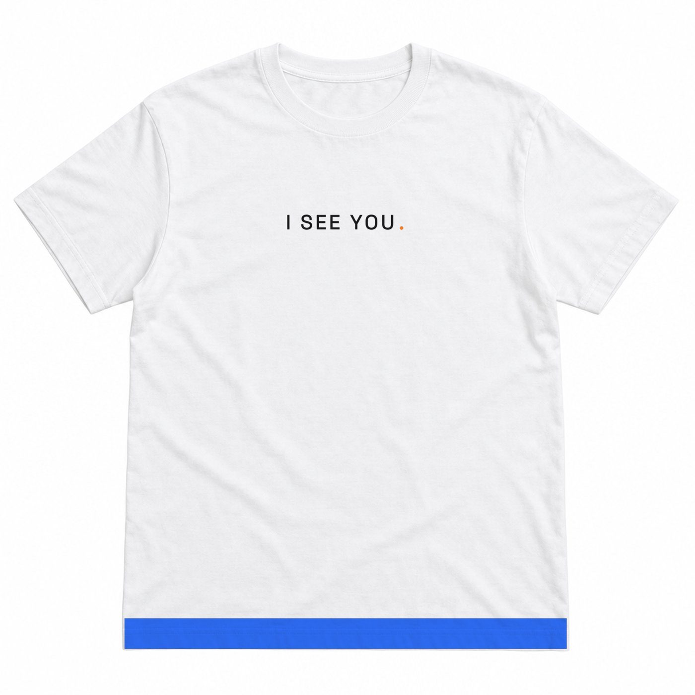
I See You.
The mark. The thing you say to a person. The title in blue; the single orange period is the only accent it ever gets.
03 / Send-off
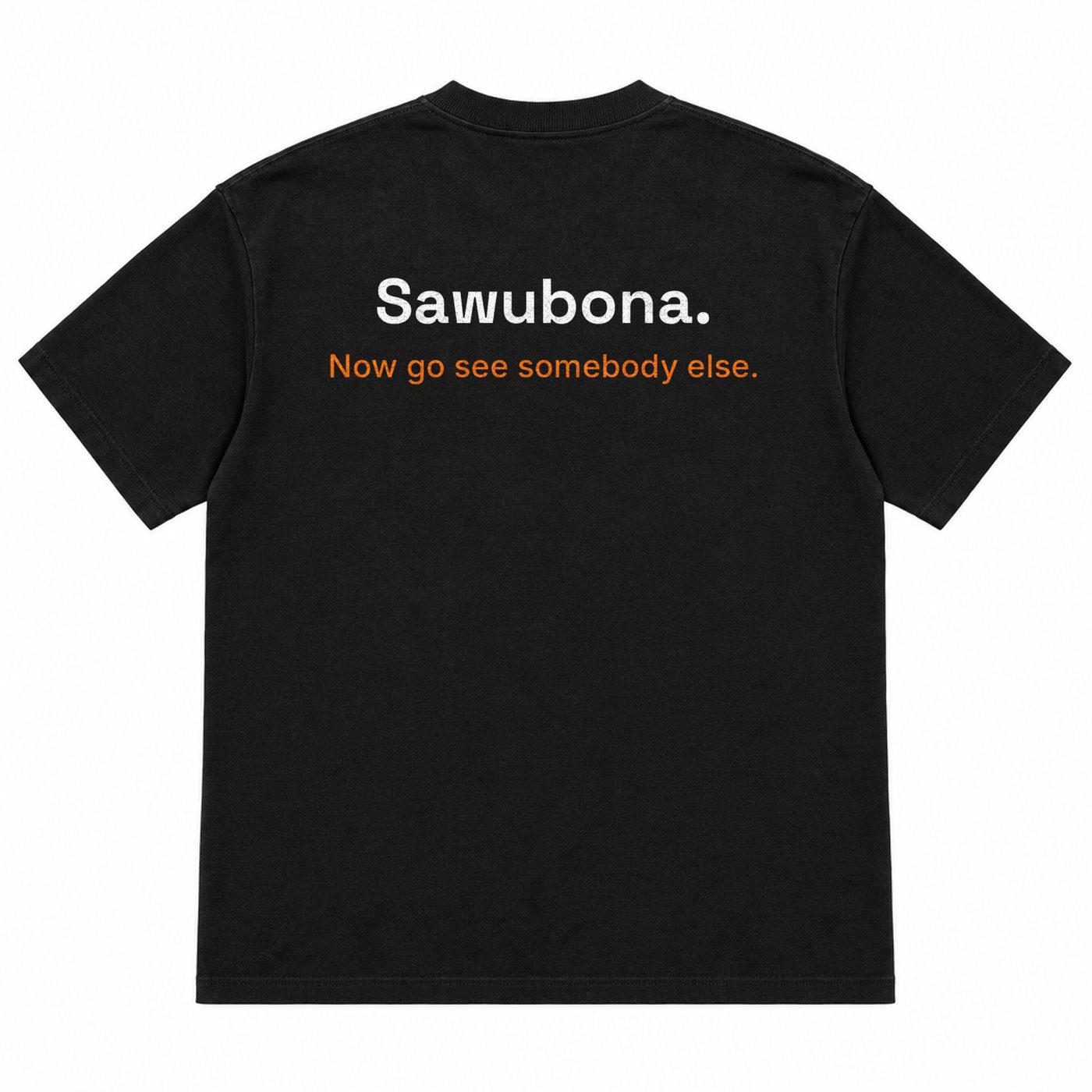
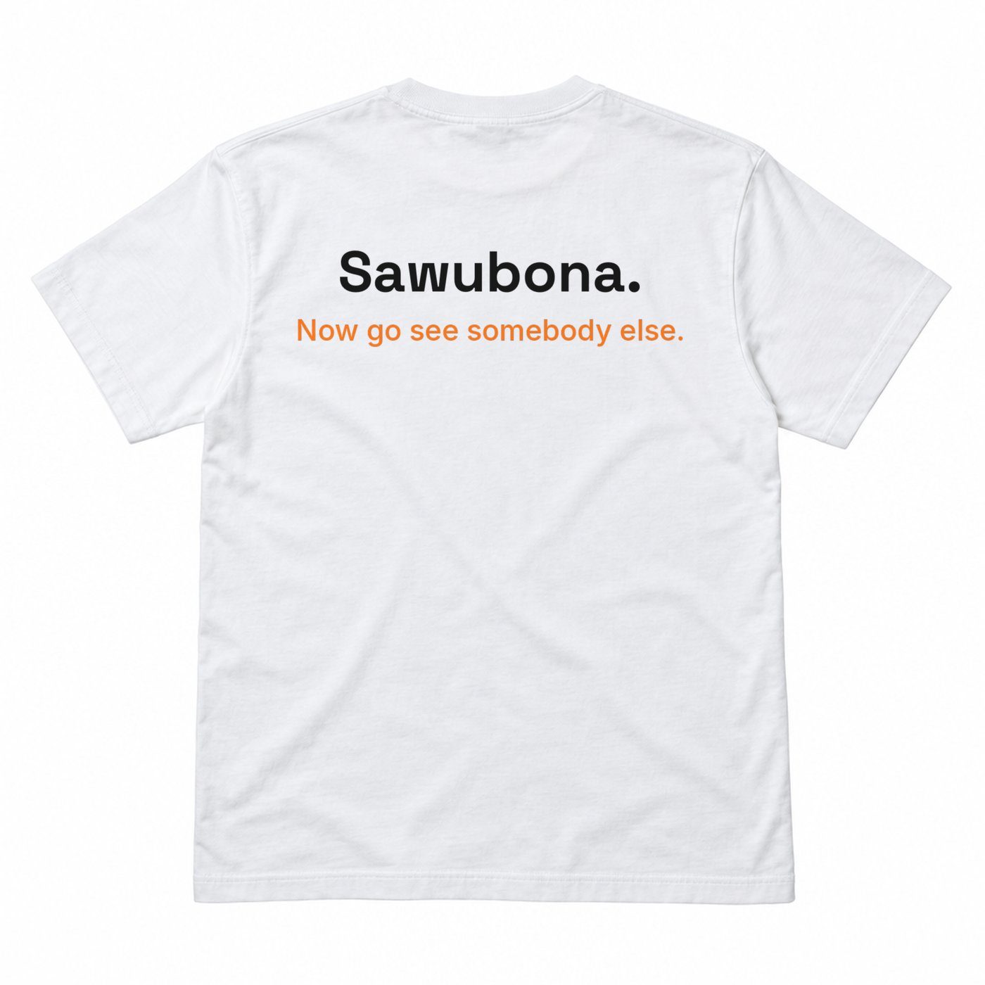
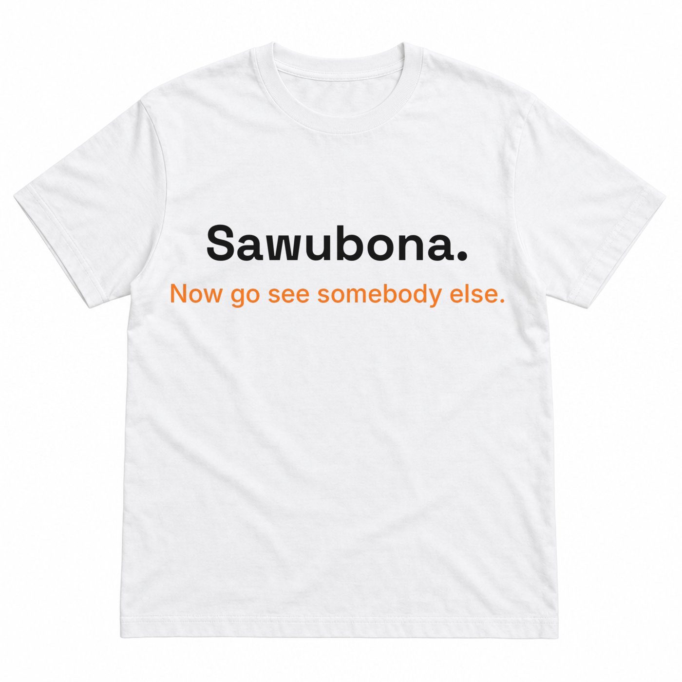
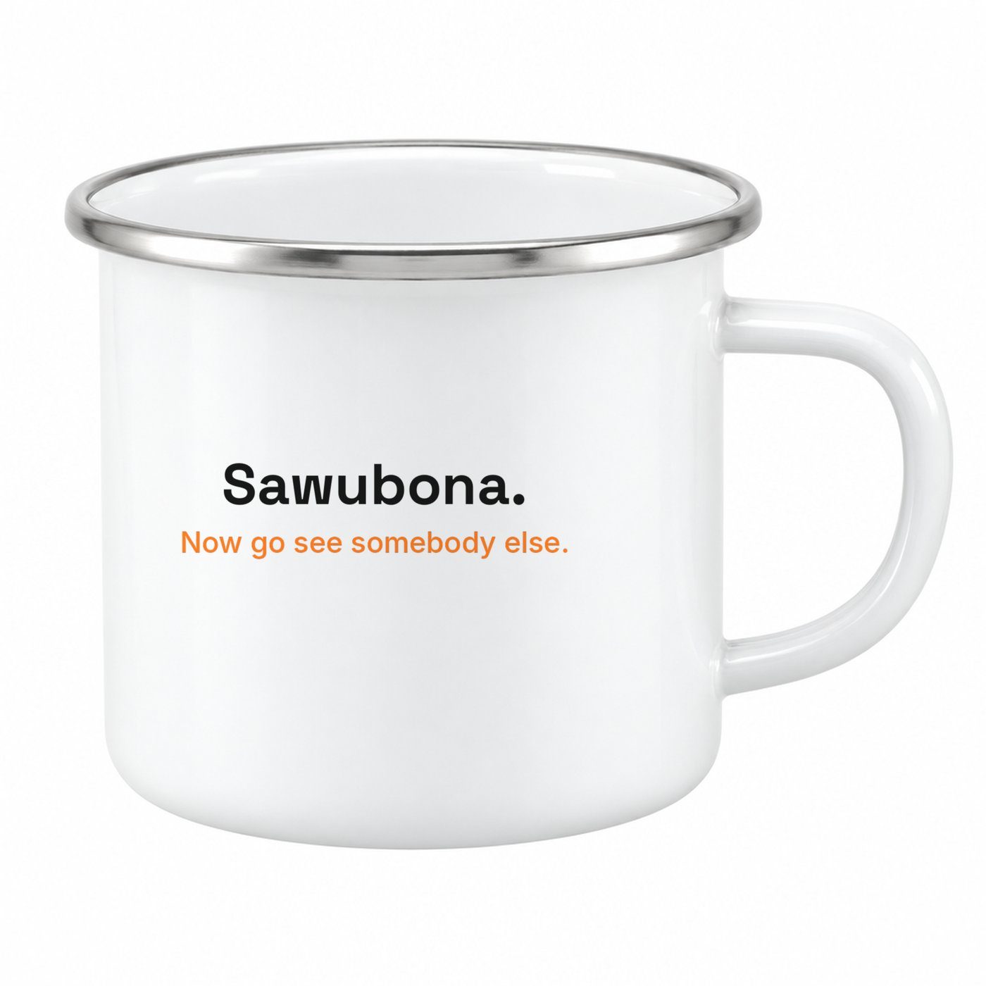
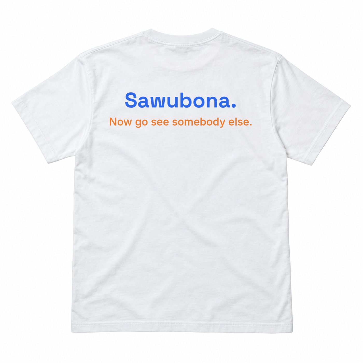
Sawubona. Now go see somebody else.
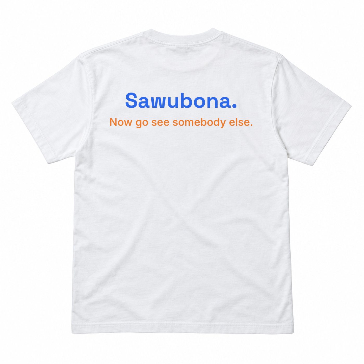
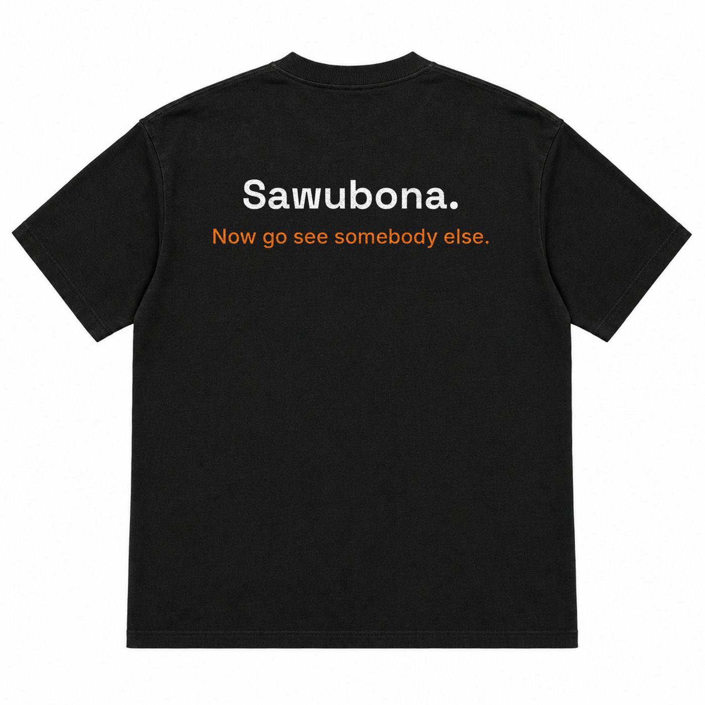
The practice, the call to action. Final line of the book. Sawubona is a Zulu greeting, credited as cultural; the closing imperative is Rick's, and it is the only place orange is allowed.
The rule that changed on October 6. Orange belongs to the call to action only: the send-off and the 5% ask. All six March covers put orange on the word YOU or in the aperture core. That is now off-brand. Nine of the ten directions here respect the rule. One breaks it on purpose, and says so.
04How to read the ten
Every direction takes the same four tests.
1"
The shelf at one inch
Does it survive a 96 px thumbnail and the 160 px Amazon grid? That is where most covers are first seen.
p.
The interior page
What art language does the cover imply inside, and does it hold the one-shape, one-hand system?
tee
The garment
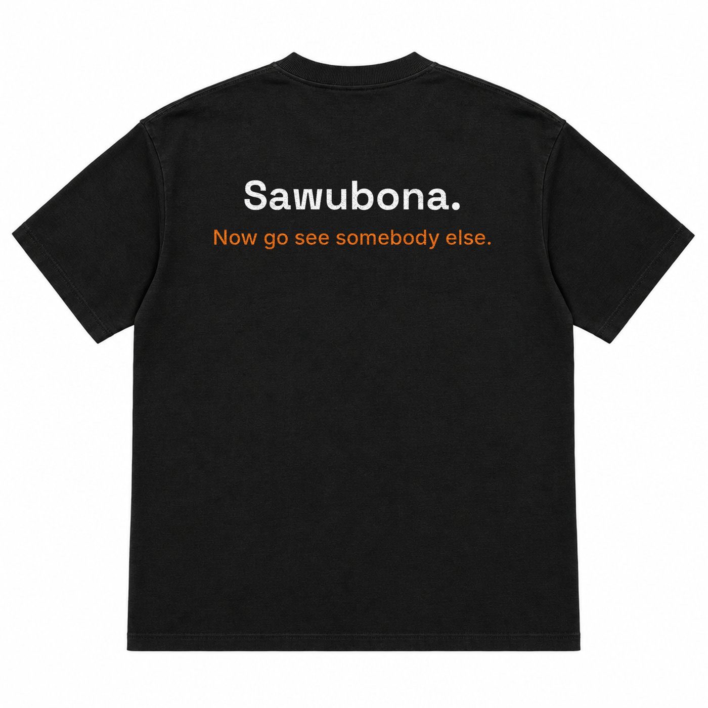
Does it make someone see someone else, or signal you are available to be seen? The back always carries the send-off.
→
The connection mechanic
Book, quiz, letter, practice. Each direction gets the mechanic that fits it, grounded in something already built where one exists.
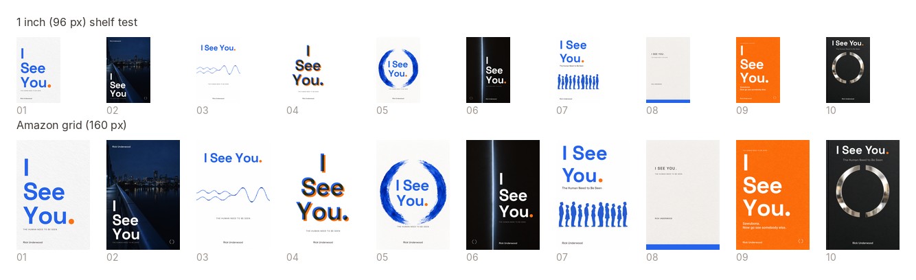
The shelf test, all ten. Top row at one inch (96 px), bottom row at the Amazon grid (160 px). Cover 08 is shown here as rendered this morning on cream; the direction screens carry today's pure-white recomposite.
Order. The ten are presented in the brief's rank order, not by concept number, so the deck reads as a case. Each keeps its concept number so it matches the files. The render logs rank the finished pieces differently in places; both ranks are shown.
05Direction 1 of 10 · Concept 01
01
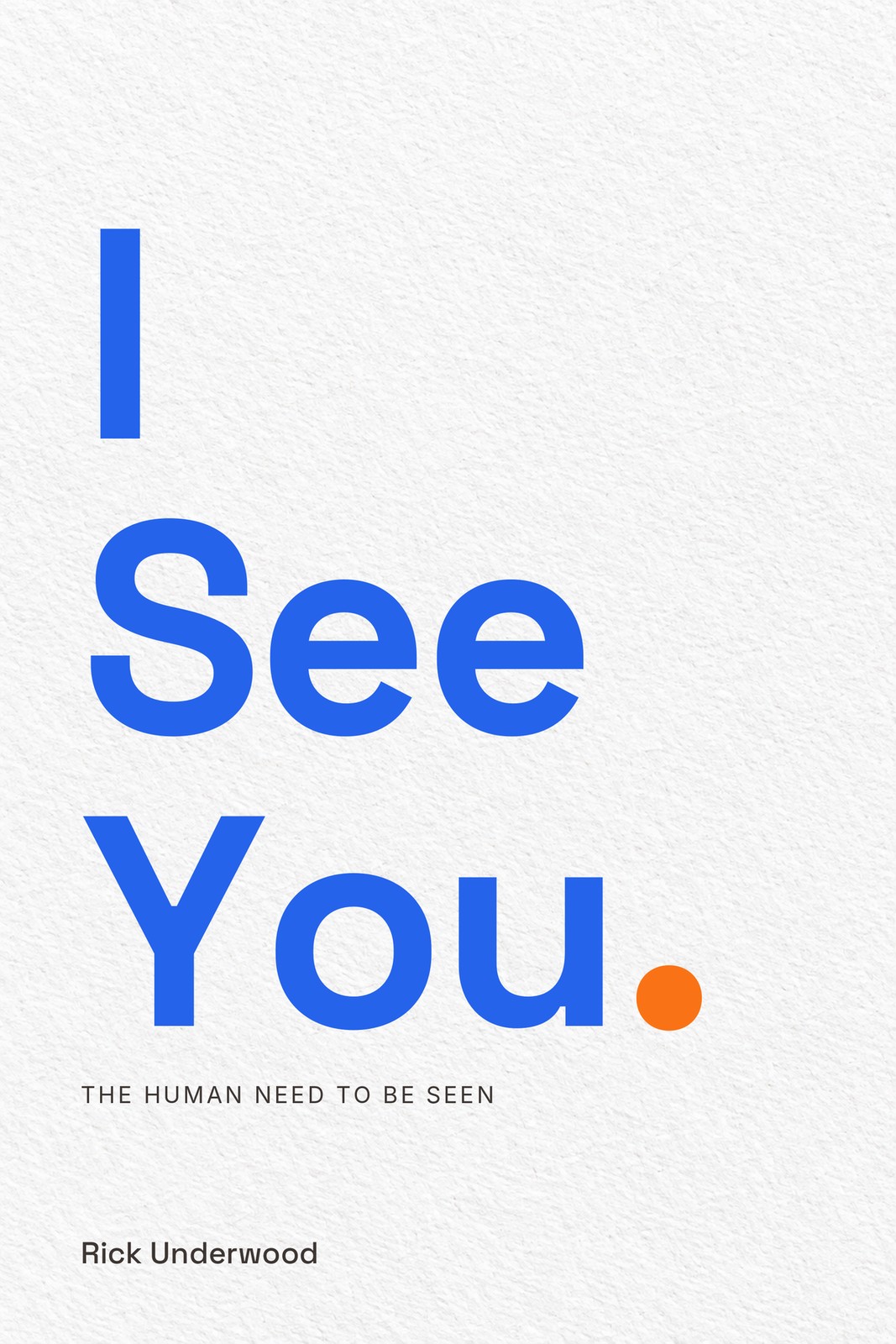
The Period
The title and its orange period, nothing else. The smallest mark on the cover carries the biggest weight.
Carries
The title as invitation, and the Power of One. The period is the one.
Ground WhiteOrange The period only
160 px · Amazon grid
96 px · one inch
05Across everything · The Period
Interior
15d. Sawubona, the typographic end page
This direction foregrounds the ten typographic pages. The book's sentences set alone on a page, Space Grotesk, one colour, and the end page where the title's period becomes the last mark the reader sees. The iris chapter-mark system rides underneath it unchanged.
Merch
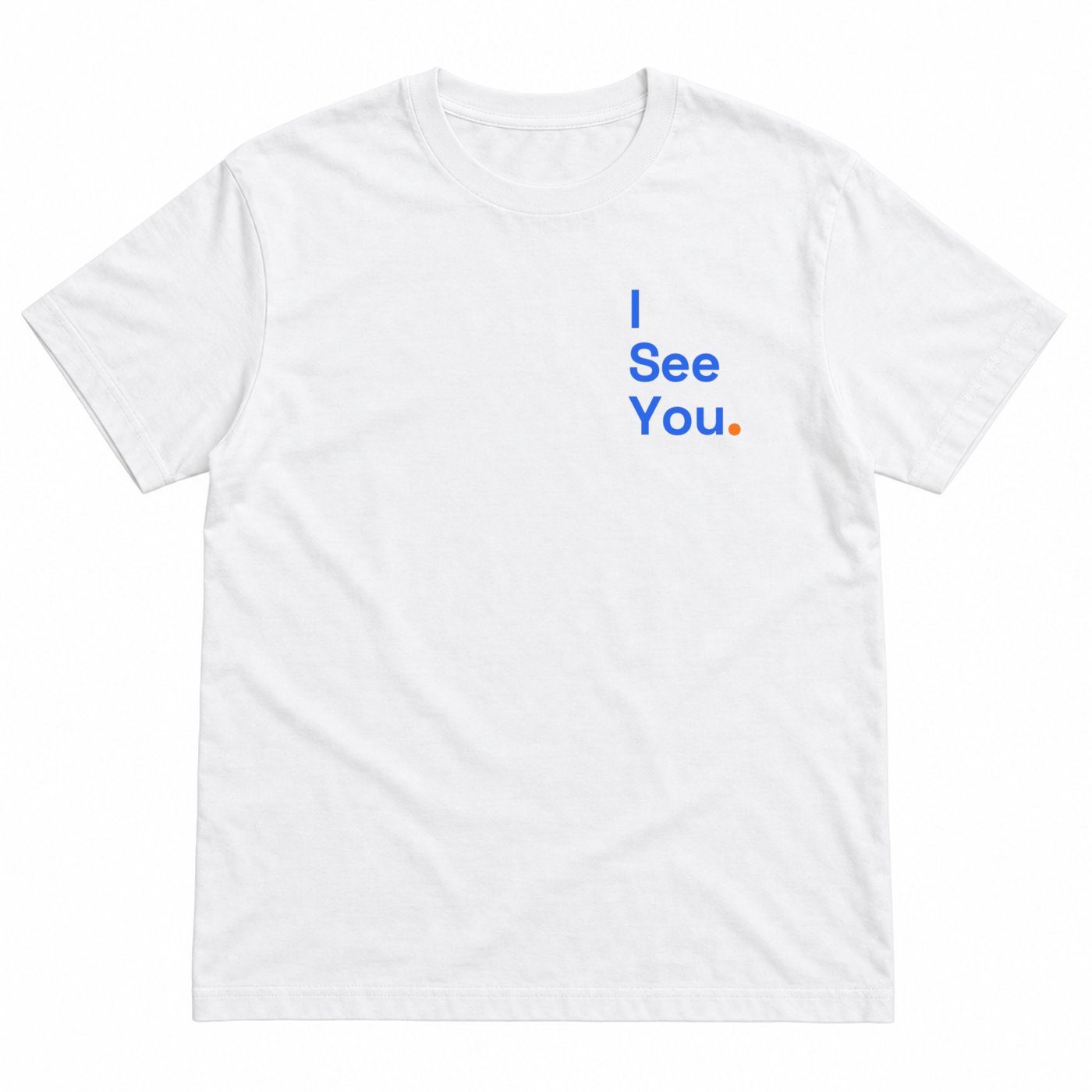
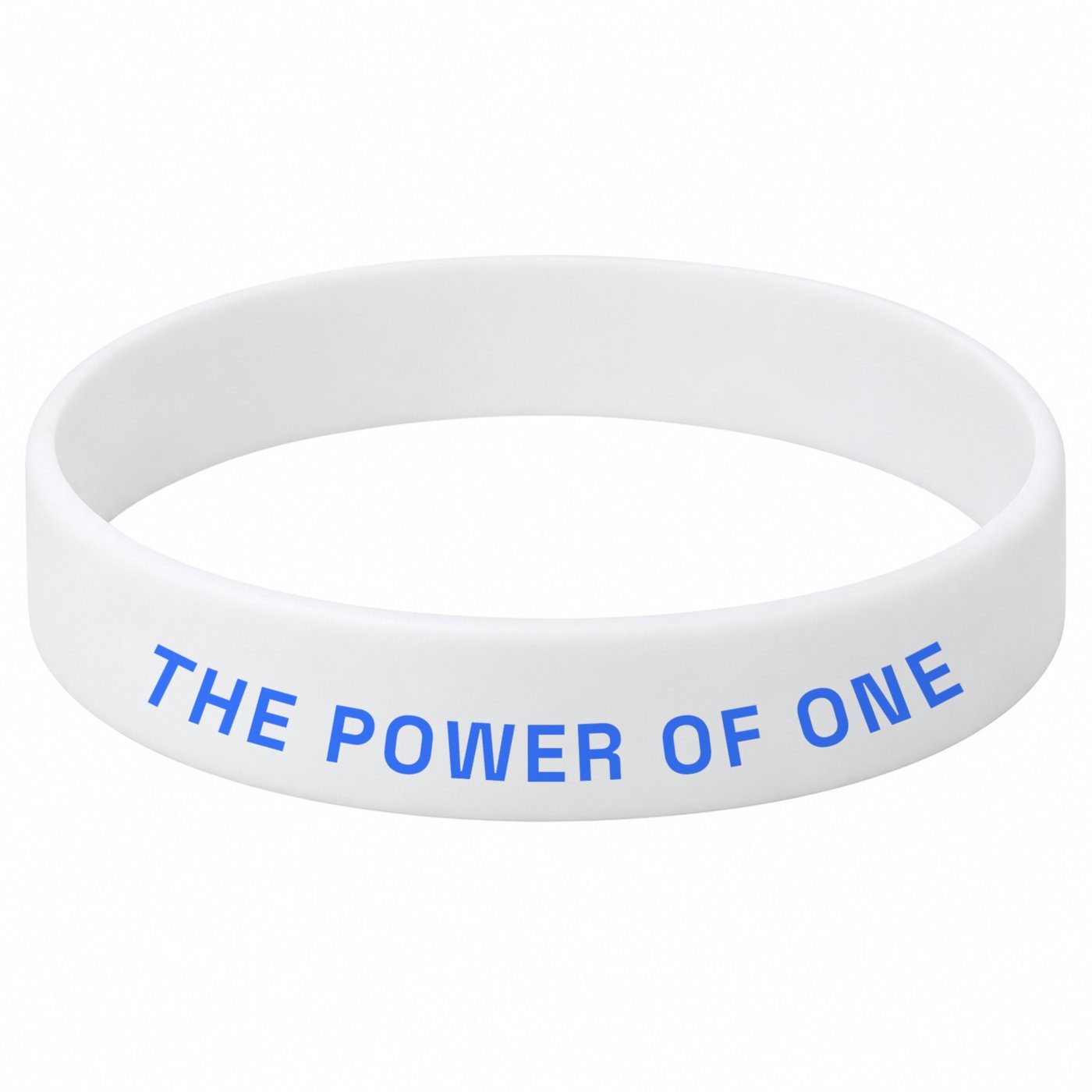
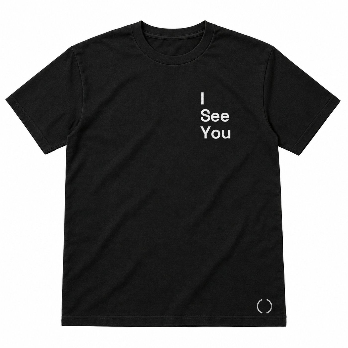
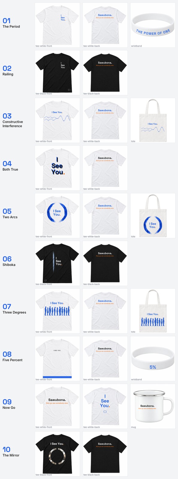
Left-chest three-line lockup, blue with the period at 115%. The wristband carries THE POWER OF ONE along the curve. The render log calls it the brand sheet on cotton.
Connection
The letter arrives as one line and a period.
The quiz already writes each reader a personalised letter. In this direction the letter opens on a single line, I see you., and the period is orange. Everything else on the page is quiet. The reader gets the title said to them before they read a word of explanation.
Built on: the How Seen Do You Feel quiz and its letter engine (local prototype, three tiers).
Where it fails
Everything rides on type craft. One point too loose and it is a startup homepage. It is also the quietest of the white covers at thumbnail, and the one-line title variant is still unrendered.
06Direction 2 of 10 · Concept 03
03
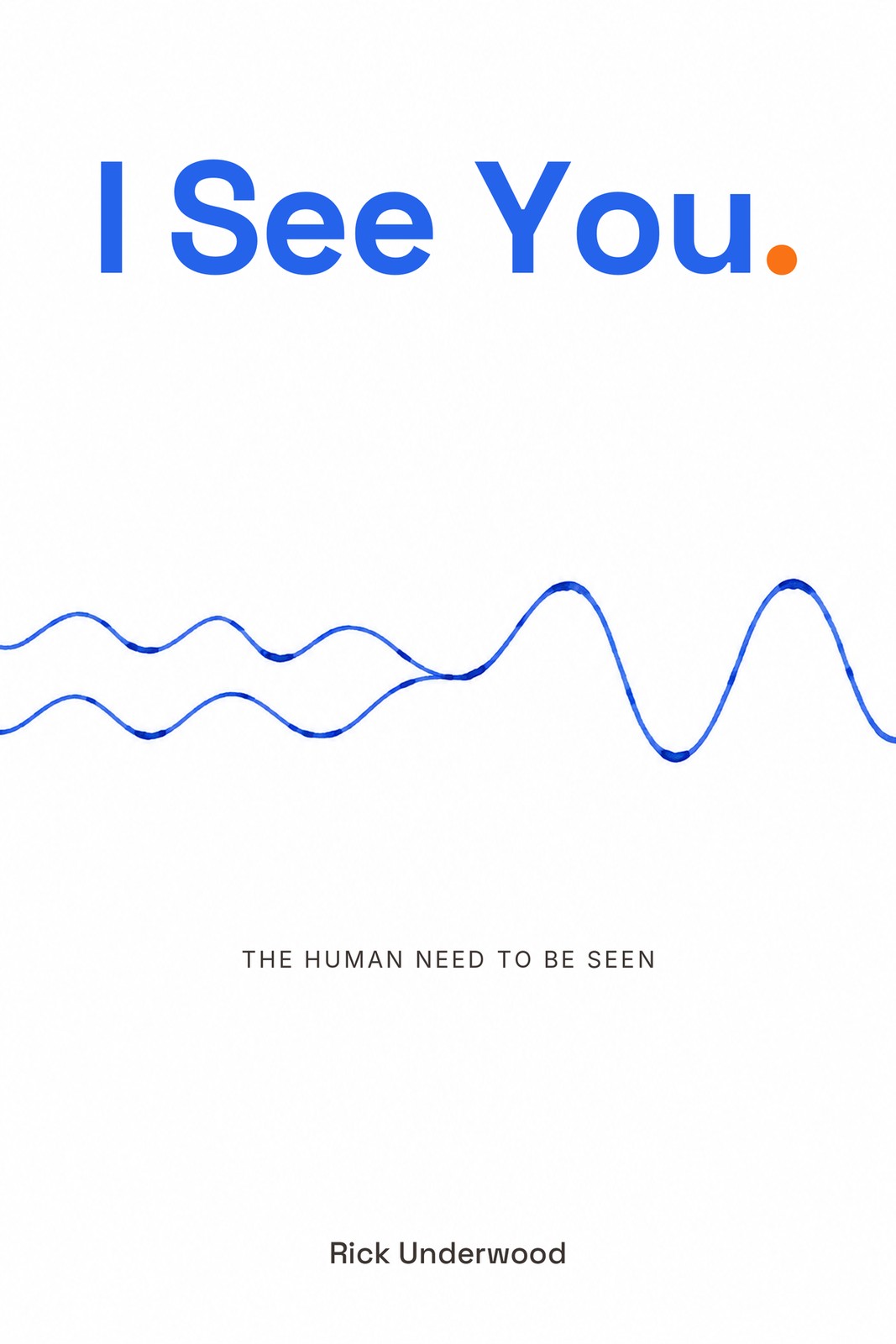
Constructive Interference
Two waves meet in step and the amplitude doubles. The book's own physics, drawn once by hand.
Carries
The wave. Chapter 15: if equal waves meet exactly in step, the combined amplitude doubles.
Ground WhiteOrange The period only
160 px · Amazon grid
96 px · one inch
06Across everything · Constructive Interference
Interior
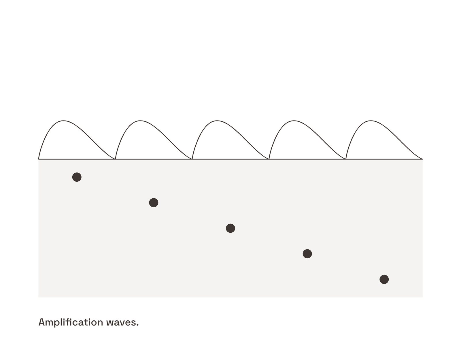
4a. Amplification waves, the first appearance of the rings
This direction is the Wave handle made visible. Amplification waves in Chapter 4 (the one person under the water), the same drawing pulled back in Chapter 11 with dozens of dots, and the blue rings with three degrees of nodes in Chapter 15. One line weight, charcoal then blue.
Merch
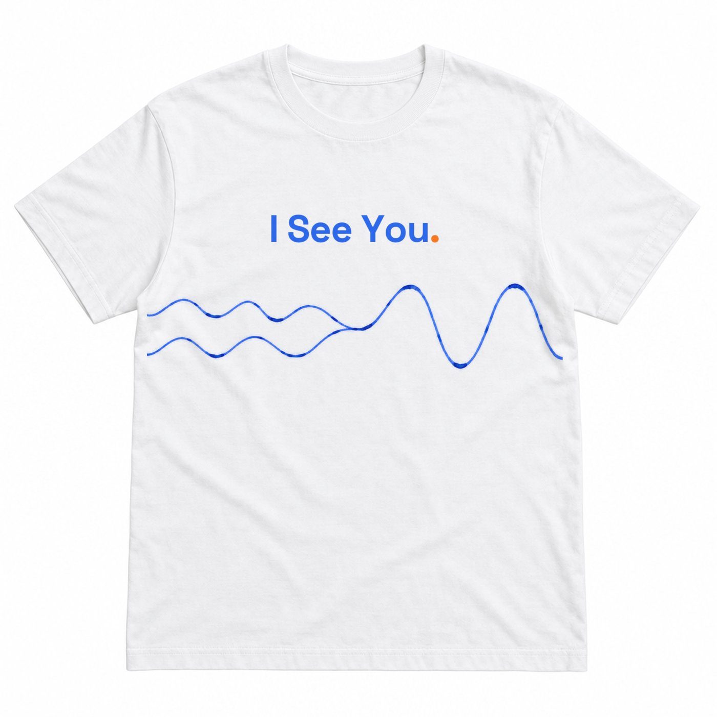
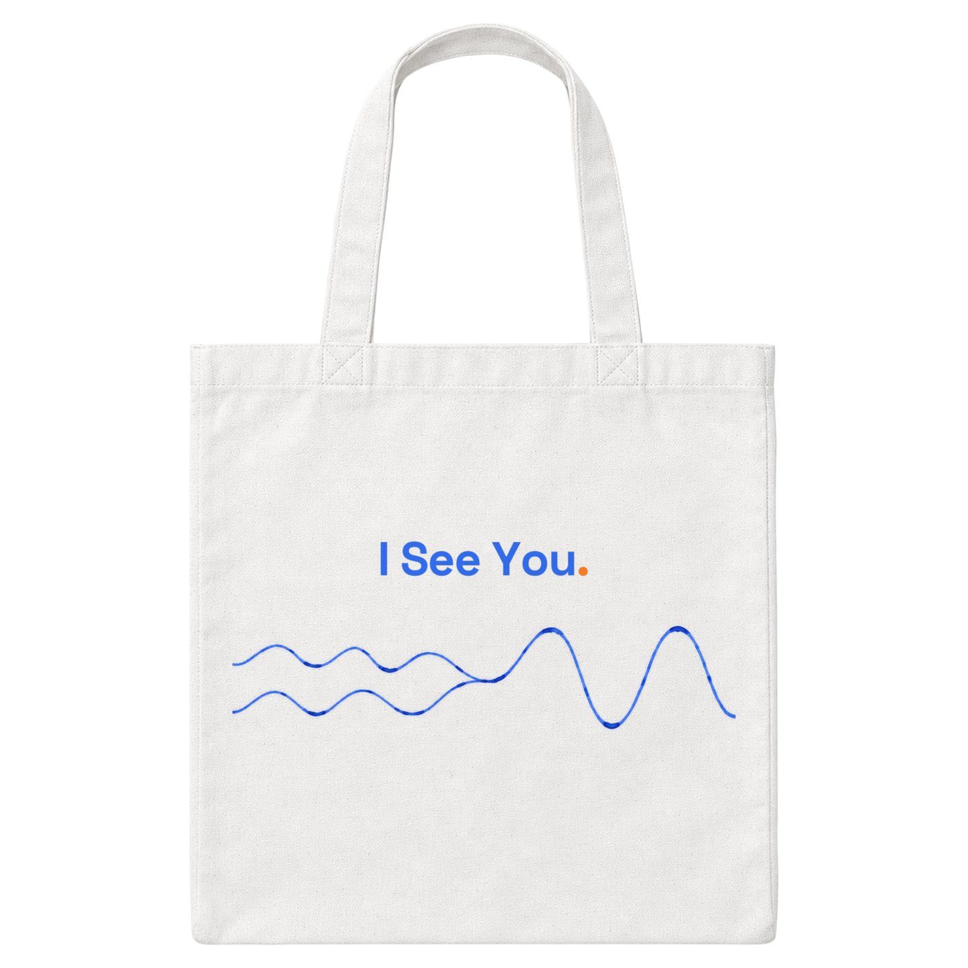
The wave cropped from the retry art runs across the chest at 58% width, title above. The tote carries the same crop at 52%.
Connection
The wave, drawn from reader responses.
Every quiz result is a point. Plotted together they make the wave the cover promises, and the reader sees their own line inside it. Near term it is an aggregate from the quiz. Long term it is the archive of reader letters, organised by cohort, that the Living Book proposes.
Built on: the quiz results today; the Living Book community archive blueprint (deferred to 2027).
Where it fails
Scale, not line quality. After the retry the hand-drawn feel is there and the physics reads, but the thin line nearly drops out at one inch. A heavier brush or a taller wave band would solve it.
07Direction 3 of 10 · Concept 02
02
Railing
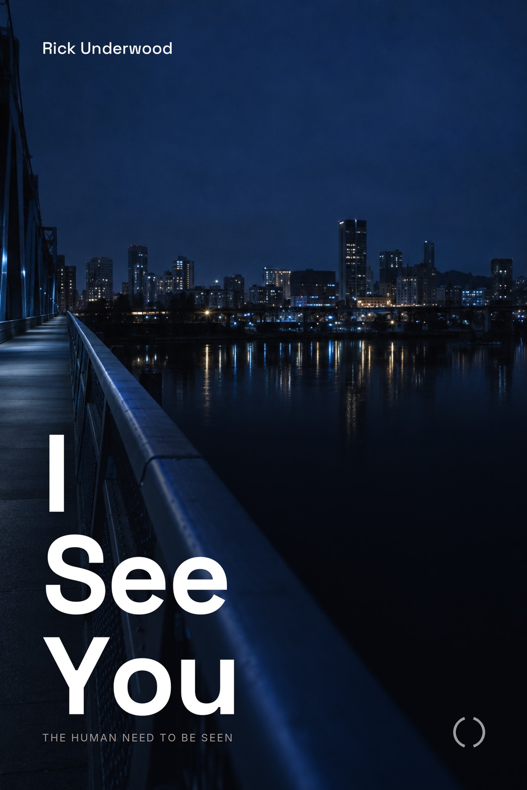
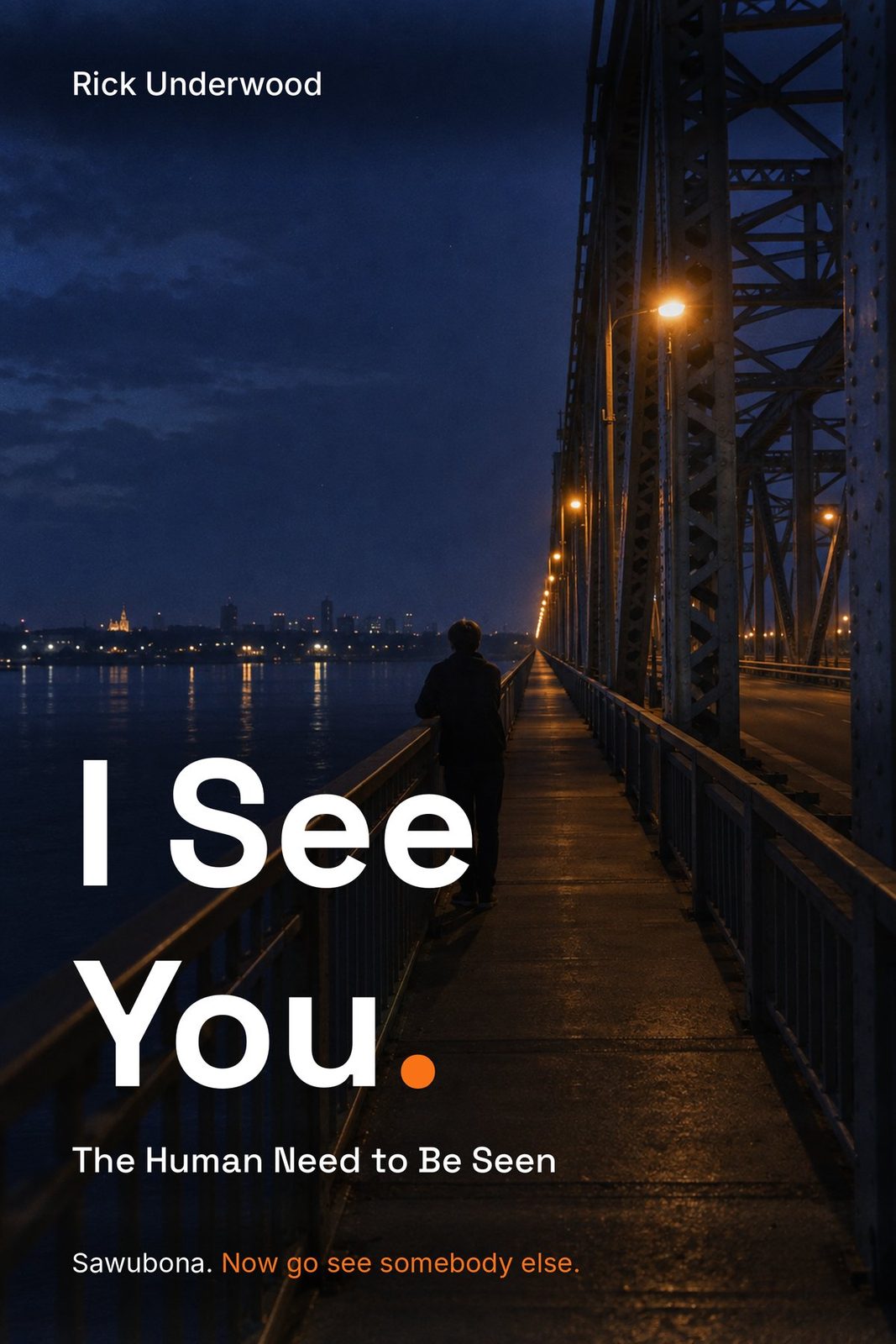
The Nashville pedestrian bridge at night, shot from the railing, looking along it. The place the book opens.
Carries
The bridge. The Prologue.
Ground Near-black, photographicOrange None on the front
160 px · Amazon grid
96 px · one inch
07Across everything · Railing
Interior
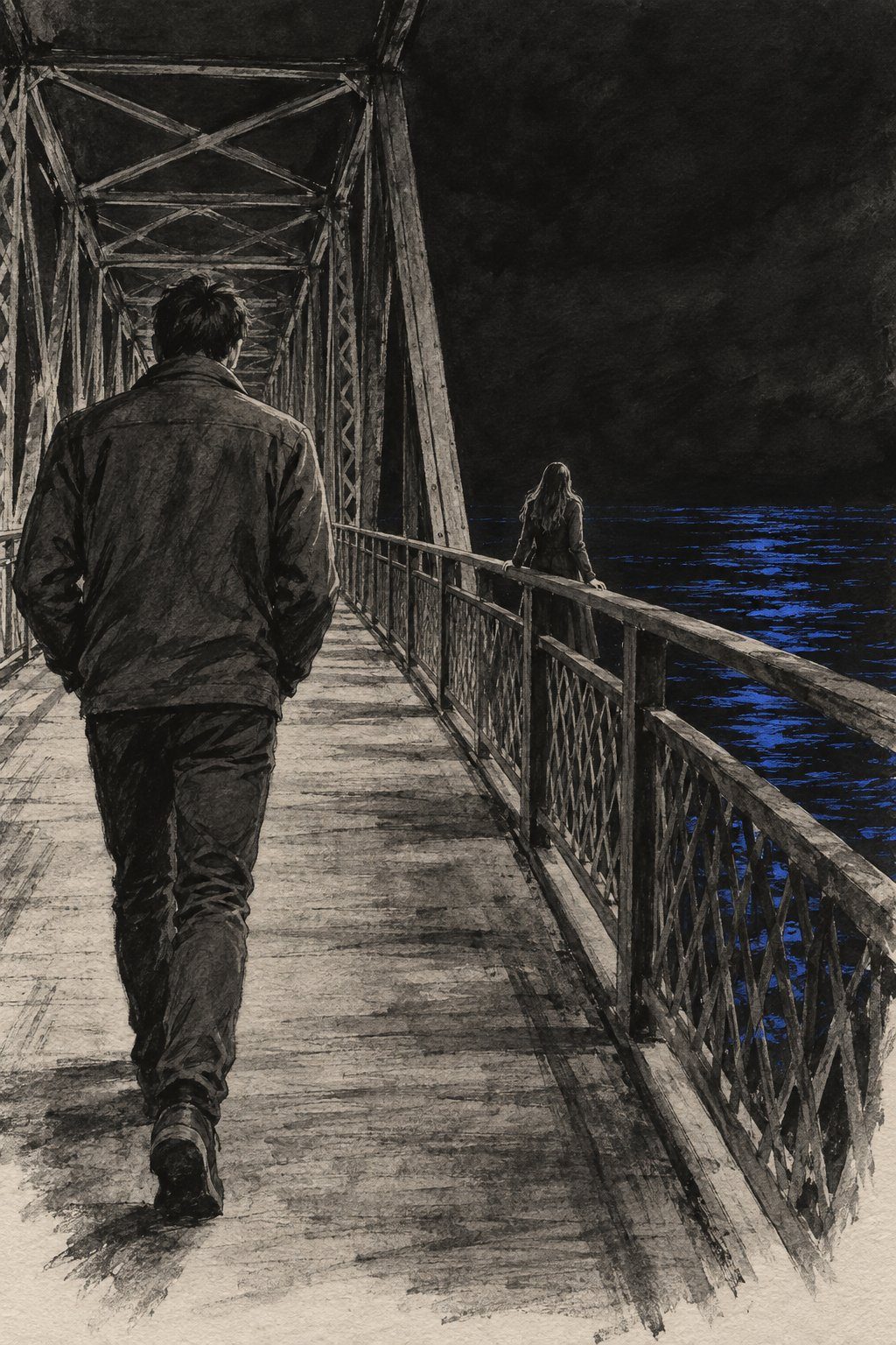
P1. The bridge, the Prologue plate
The scene plates lead here. The bridge plate opens the book and the vignette from the railing returns in Chapter 12, after the reveal, never inside the telling of that night. Ink on toothy paper, one illustrator's hand, the river as the only colour.
Merch
The photo cannot go on a shirt, so the merch is the white-on-black lockup with the two-arc mark at the hem. Honest, and the log admits it is indistinguishable from Shiboka without the slit.
Connection
The bridge as a place and a practice.
The first letter in the Letters to the Unseen collection was written for the person on that railing. In this direction the QR page is the bridge: the reader scans it, reads Rick's letter, and is invited to leave one for someone they know is standing there.
Built on: the Letters to the Unseen QR collection (one letter authored, safe-messaging read pending).
Where it fails
Without the Prologue it is a travel photo. The type still sits partly on the railing and the title is the smallest of the ten at one inch. Dark covers print muddy on KDP matte. And a bridge railing can read as the thing it is: that has to be a choice Rick makes, not one that happens to him.
08Direction 4 of 10 · Concept 05
05
Two Arcs
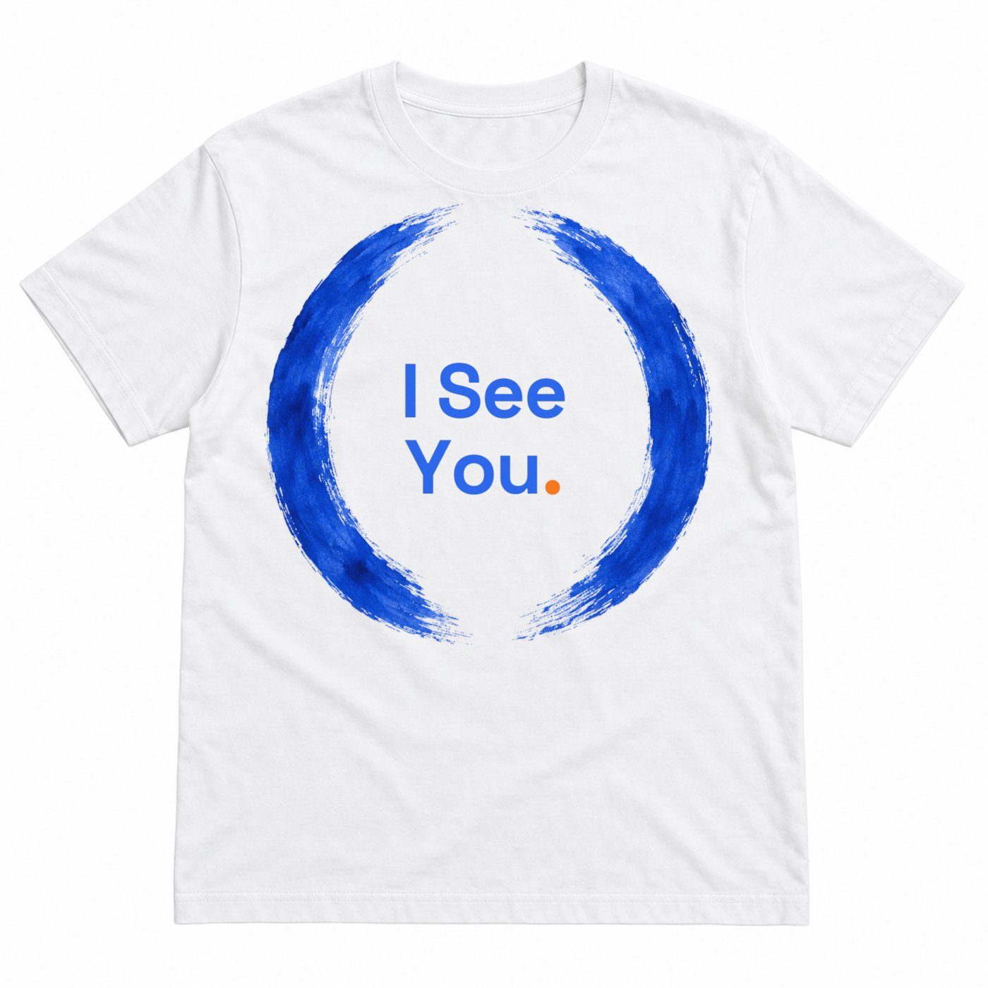
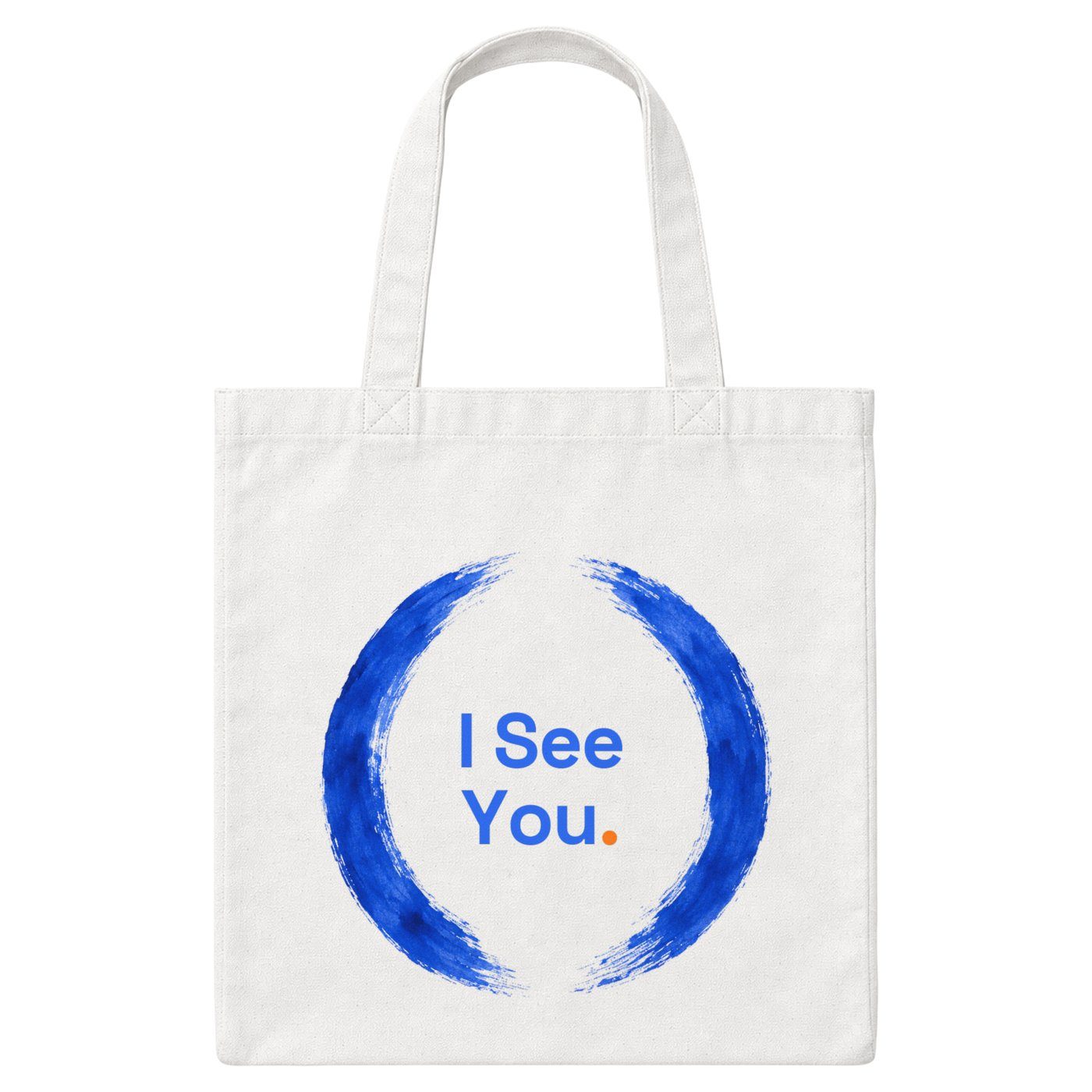
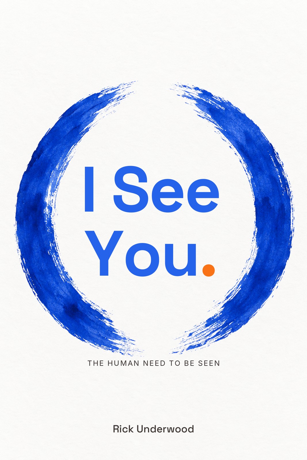
The actual brand mark, two open arcs with a gap between them, painted by hand and made the whole cover.
Carries
Seeing. The seer, the seen, and the threshold between them.
Ground Off-whiteOrange The period only (variant with a blue and an orange arc unrendered)
160 px · Amazon grid
96 px · one inch
08Across everything · Two Arcs
Interior
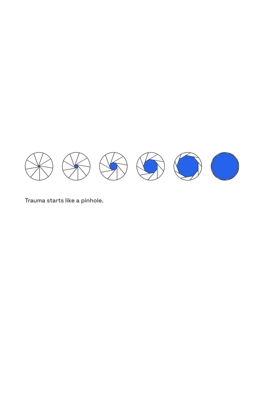
2a. The aperture: the pinhole opening one stop at a time
The one-shape system. Every diagram in the book is a circle that means something different depending on where the reader is: the iris, the wound-loop, the ripple, the halved duality. The cover's open circle teaches the grammar before the reader meets a single figure.
Merch
The brush circle keyed from the cover art with the title centred on its ink centroid. The merch log's strongest piece: a finished tee and tote as-is.
Connection
The mark becomes the thing people send each other.
The quiz letter ships as a PDF. In this direction the letter carries the open circle at the top and a share card at the bottom, so sending the mark to someone is the same gesture as saying the title to them. The favicon, the avatar, the spine and the share card are one object.
Built on: the quiz letter PDF template in the prototype; the Letters to the Unseen page.
Where it fails
Enso covers are a crowded lane, and one clean stroke too many makes it a yoga studio logo. The gap and the two-stroke structure are what make it ours. The blue plus orange arc variant needs Rick's ruling.
09Direction 5 of 10 · Concept 07
07
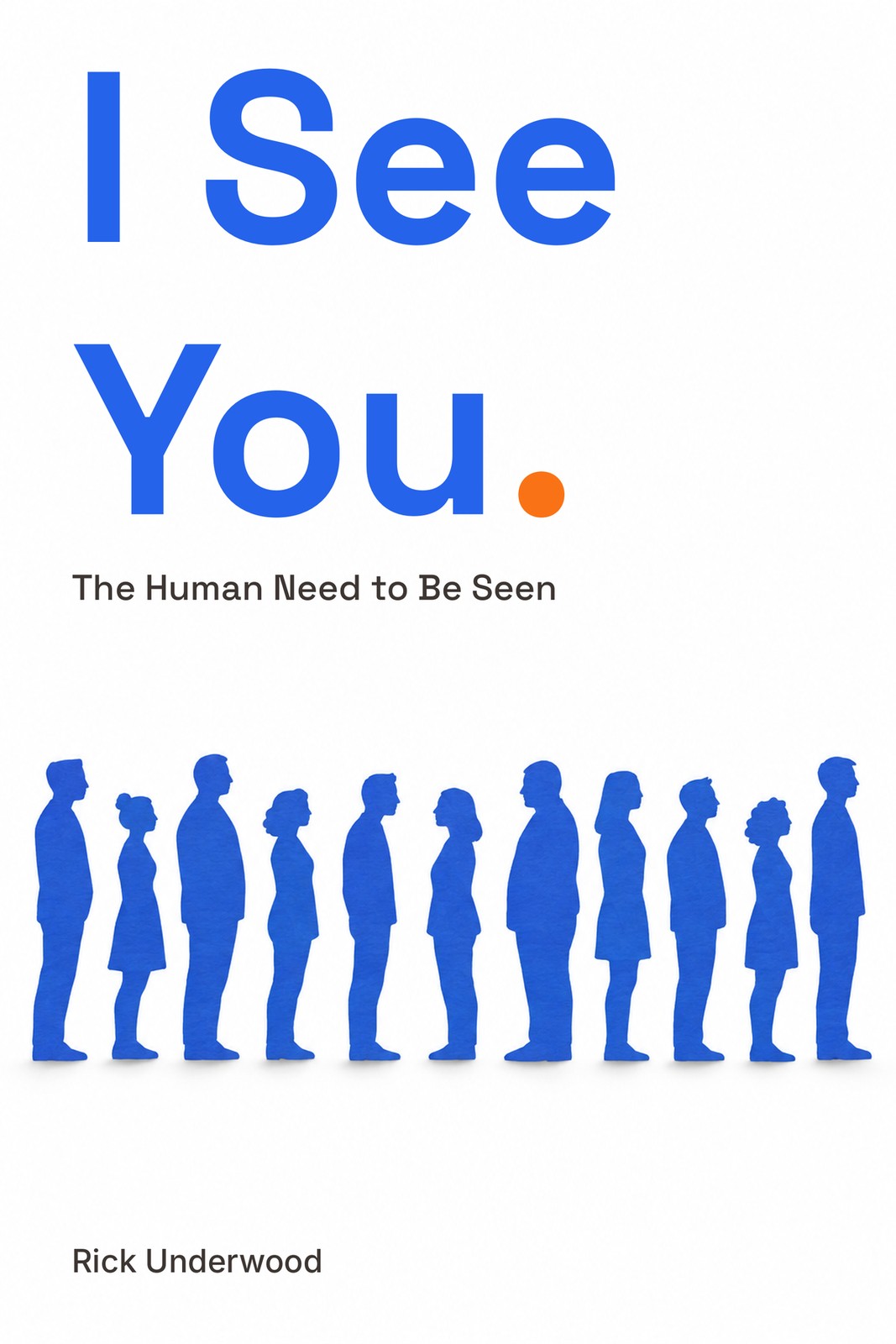
Three Degrees
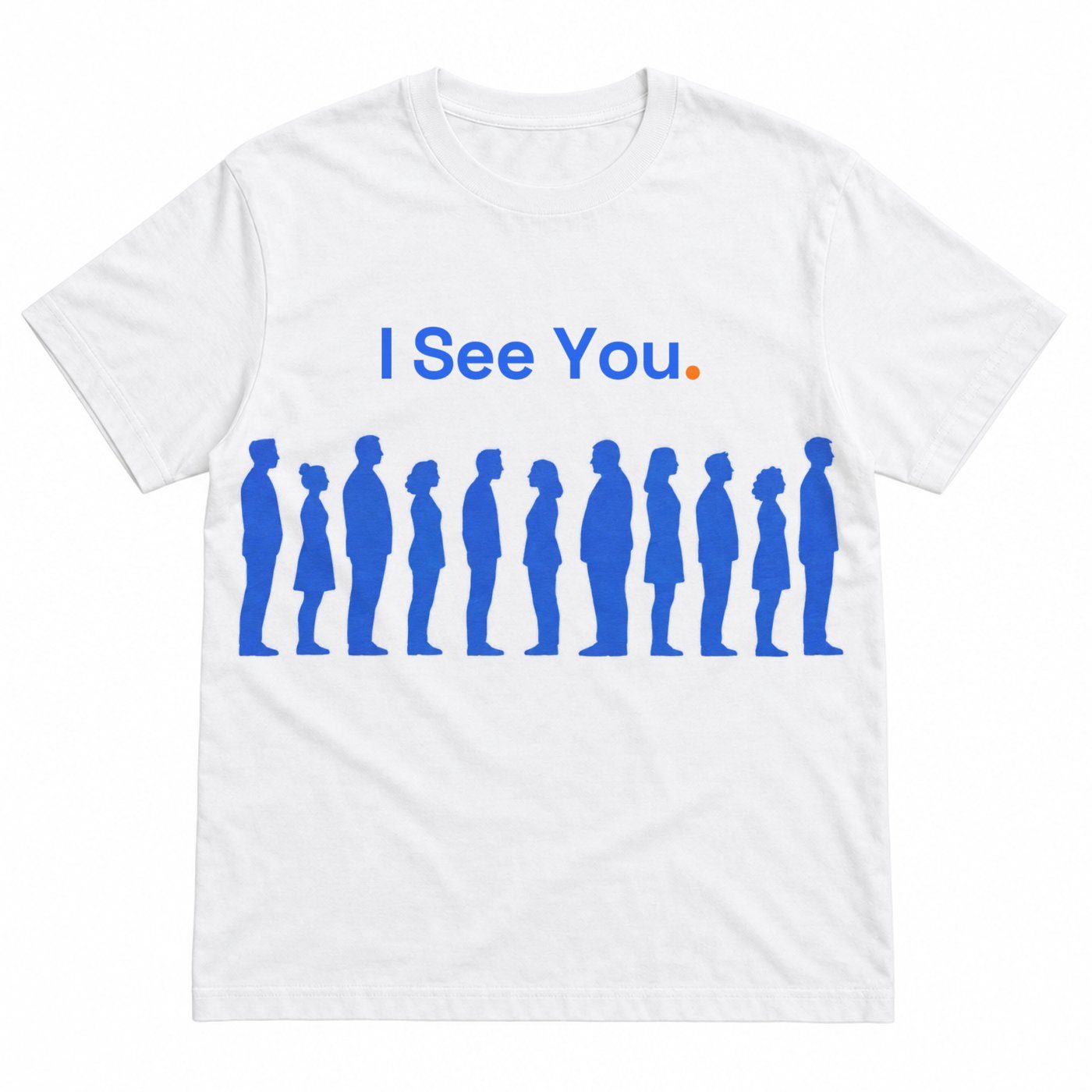
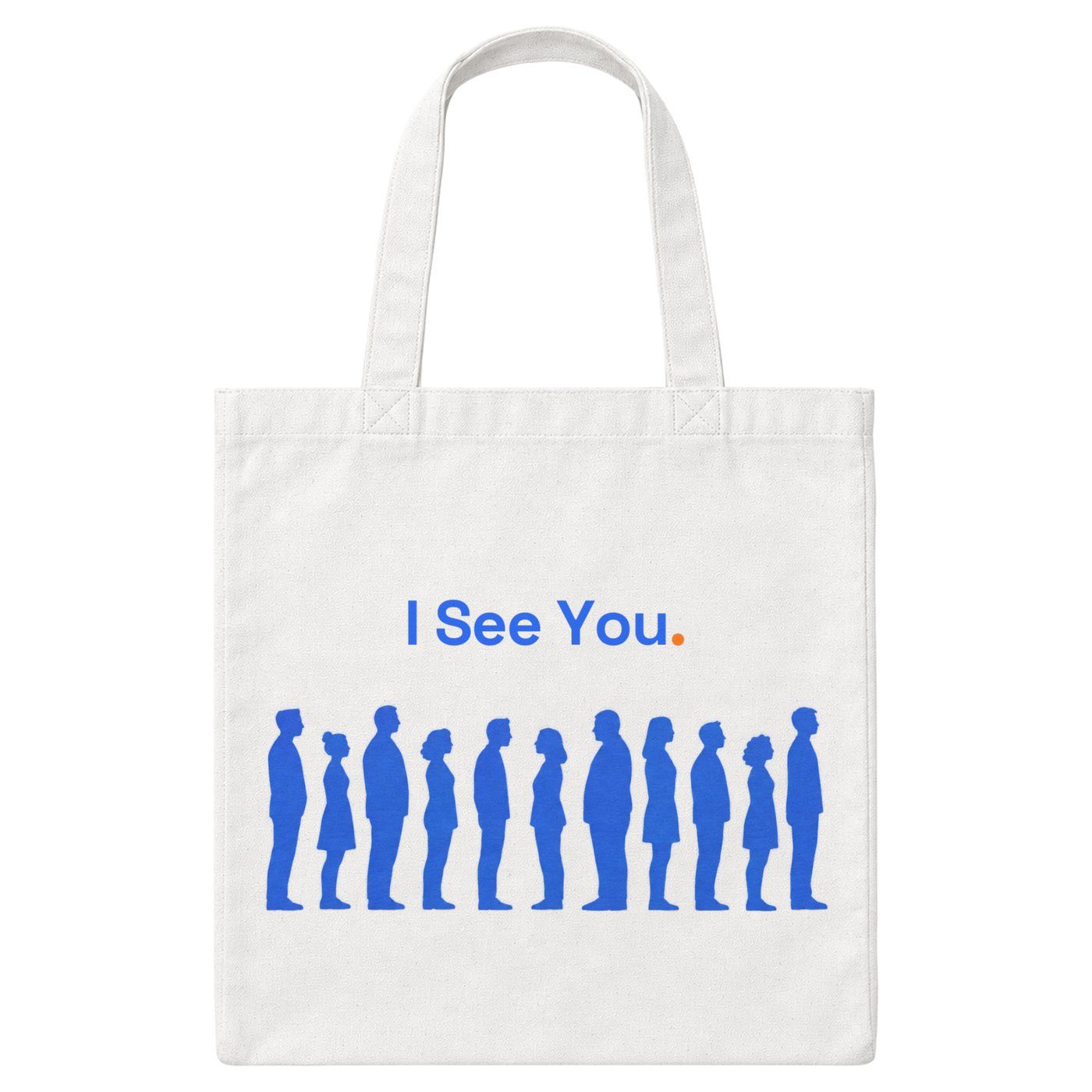
A row of paper-cut silhouettes, all facing forward, except one who has turned to face the person beside them.
Carries
The wave and the Power of One. One person sees another, three degrees.
Ground WhiteOrange The period only
160 px · Amazon grid
96 px · one inch
09Across everything · Three Degrees
Interior
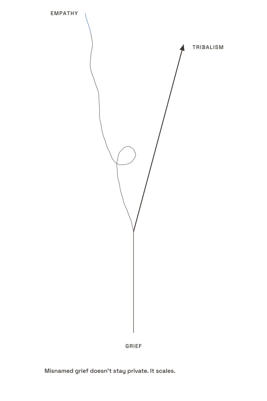
11a. Shared grief, two paths: the one turn that changes the curve
The human figures. This direction leans on the plates where one person is doing the walking (the bridge, the bench), and on the Chapter 13 curve that turns because of one dot. The figures are always from behind or at distance, never a face.
Merch
The silhouette row at 56% width with the title above. The merch log: the only piece that tells the book's story without a word, and it carries to the tote.
Connection
Name one person you saw this week.
The newsletter closes every issue with one question: who did you see this week? Readers reply with a name or a line. Nothing is scored. The point is the turn, repeated until it is a habit.
Built on: the planned Kit newsletter (direct-to-reader plan in the KB).
Where it fails
The airport-signage failure mode is real. The rendered silhouettes are cleaner than cut paper and hair silhouettes crept in. Not clip art, the log says, but not Saul Bass either. Needs an illustrator's hand.
10Direction 6 of 10 · Concept 06
06
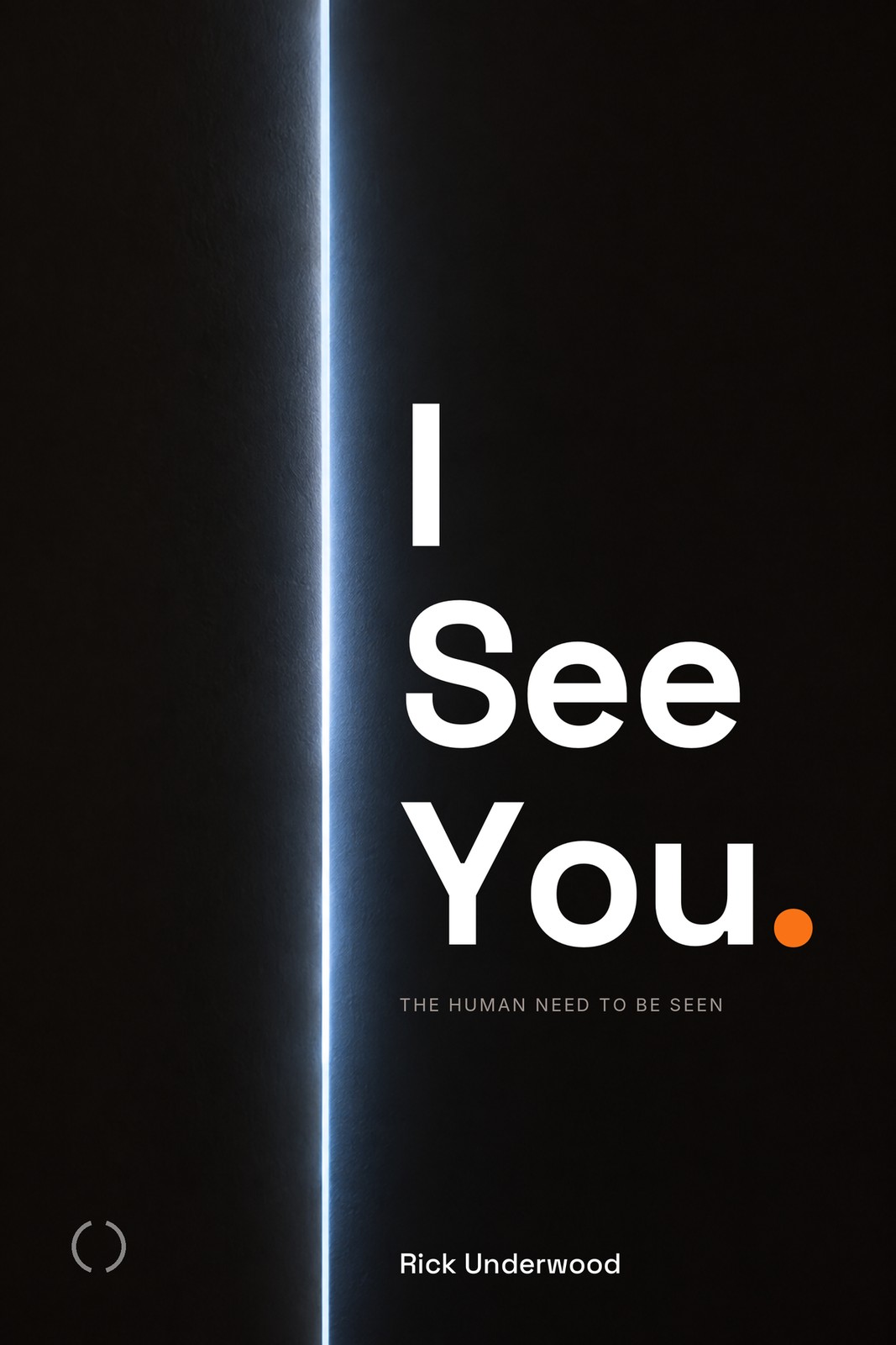
Shiboka
Black cover. A door opened half an inch. Light coming through.
Carries
The pinhole. Chapter 15: the door that opened half an inch in that chair kept opening. Shiboka: because you see me, I am here.
Ground BlackOrange The period only
160 px · Amazon grid
96 px · one inch
10Across everything · Shiboka
Interior
The chapter-mark iris: closed at the Prologue, open by Chapter 15
The iris that opens one stop per chapter is this cover's interior. A reader who notices finds the book's arc in the margins. The Epilogue carries the open iris solid blue; the end page carries it in white outline on blue.
Merch
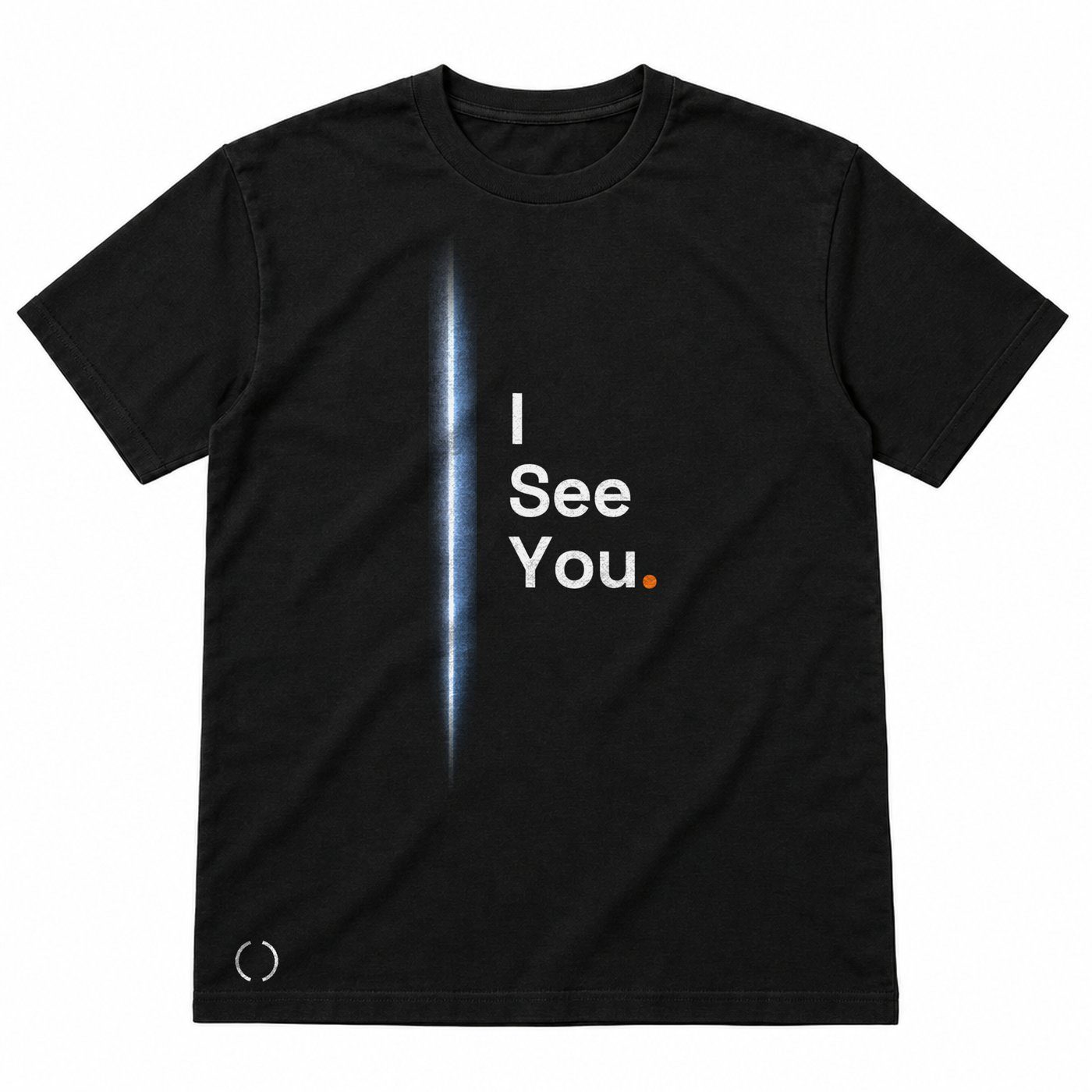
The slit of light cropped from the art, faded top and bottom, with the three-line title to its right. The back carries the send-off like every tee.
Connection
Letters to the Unseen.
Because you see me, I am here. The QR page at the end of Part Three opens the collection: Rick's letters that are not in the print book, and a place for the reader's own. This is the direction where that page is the whole connection layer, and the design of it is already specified.
Built on: the Letters to the Unseen QR collection and the Part Three QR page in the art map.
Where it fails
One wrong lighting move and it is a thriller. Rich black on KDP matte needs a built black, not 100K, or it goes grey. The merch has no art of its own beyond the slit.
11Direction 7 of 10 · Concept 10
10
The Mirror
The cover is a mirror. The reader picks it up and is seen.
Carries
Seeing and the title as invitation. I See You said to the person holding the book.
Ground Black, mirror panelOrange The period only
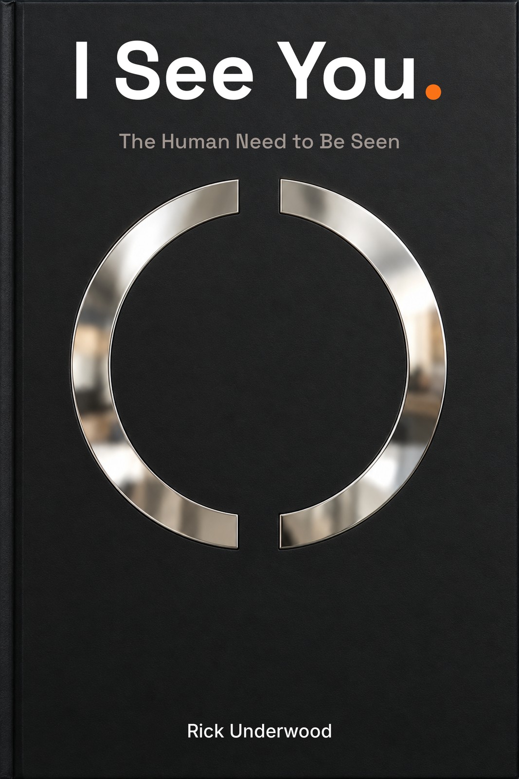
160 px · Amazon grid
96 px · one inch
11Across everything · The Mirror
Interior
6c. Old operating system, new operating system
Chapter 10 has the figure this cover wants: the mirror that gets bigger, the screen as a mirror that reflects more of you back each time. Next to it, the operating-system spread: the closed loop against the open line. Both are the reader looking at themselves.
Merch
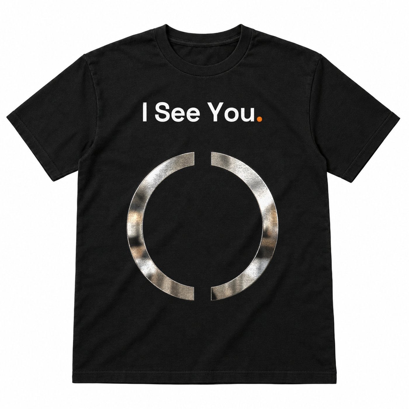
The foil ring keyed on luminance at 40% width, title above. The merch log: it looks like a real metallic print and is the most premium object on the sheet.
Connection
A result you hold up.
The quiz ends with a letter, not a score. In this direction the letter is designed to be held up: a single page with the open circle and one sentence about how seen the reader is right now, written to be photographed and sent. No chart is ever printed; the map already bans that.
Built on: the quiz and its letter engine; the back-matter assessment QR page.
Where it fails
Production. Mirror board and foil stamping are not available on print-on-demand. This is an offset run or a special edition, with scuffing and fingerprints. The digital version is a photograph of a cover. Hold it for the hardcover.
12Direction 8 of 10 · Concept 04
04
Both True
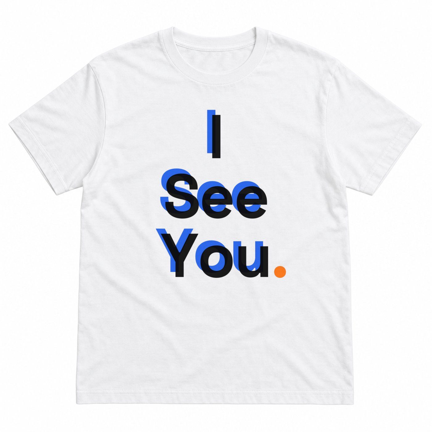
The title printed twice, slightly misregistered, blue and orange, like an anaglyph. You need both layers to see it in depth.
Carries
Duality. Chapter 3, two truths at once.
Ground WhiteOrange Shares the title (breaks the rule on purpose); compliant variant shown
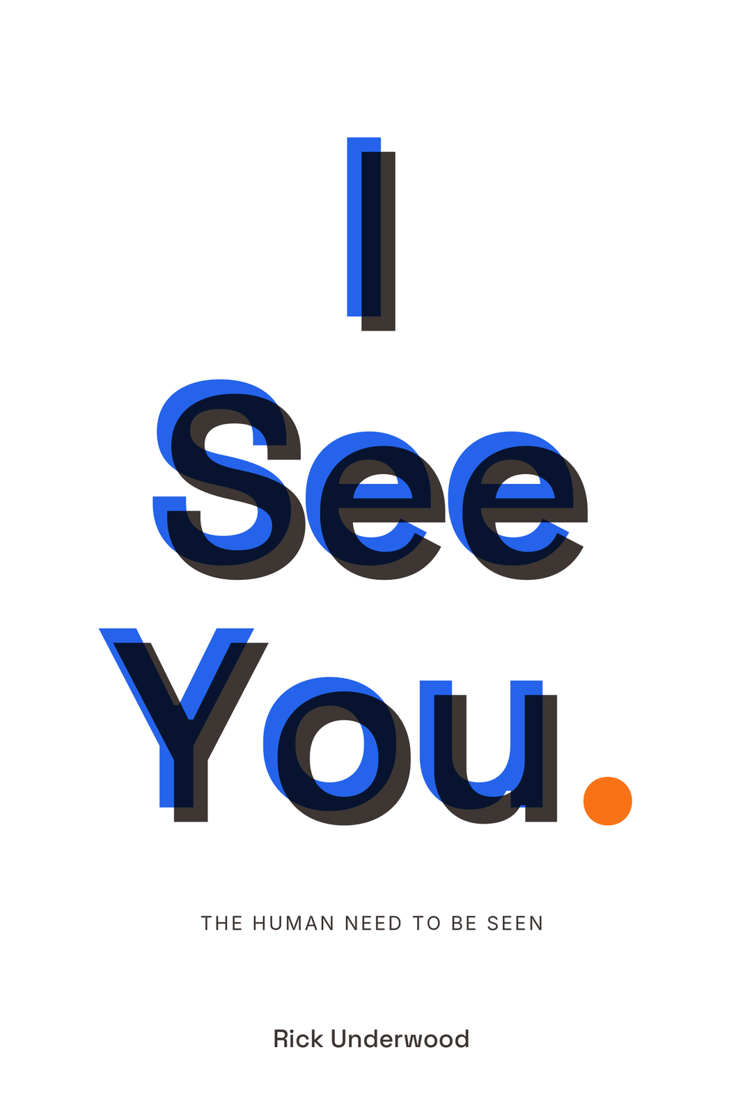
160 px · Amazon grid
96 px · one inch
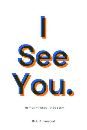
Duality variant
12Across everything · Both True
Interior
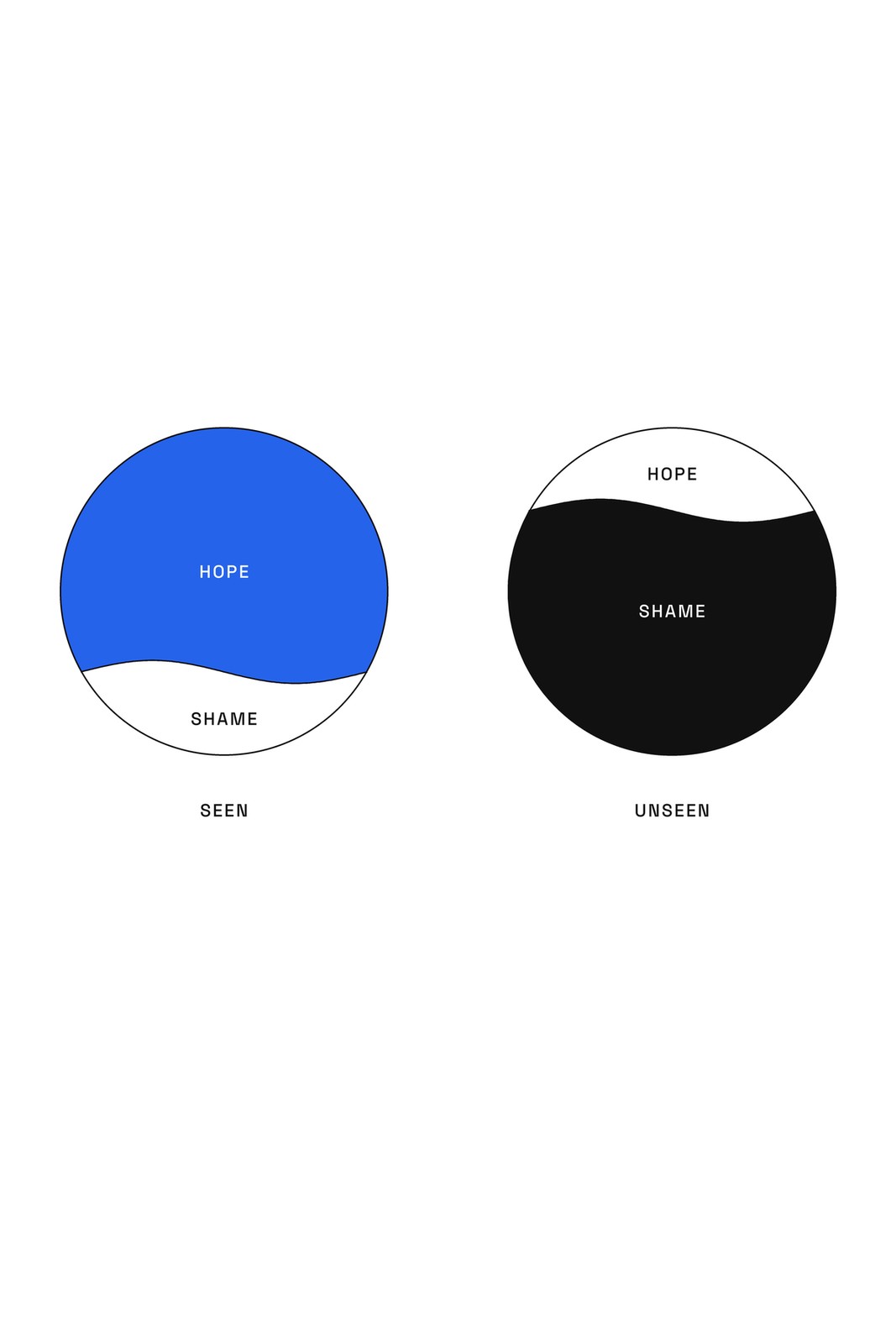
5a. The ratio: hope and shame, seen and unseen
The halved circle is this cover's interior. Its home is the ratio in Chapter 5, where the halves are unequal and the proportion flips with seeing. It returns at the Epilogue with two equal regions held in one ring: the book's picture of what the evolution looks like.
Merch
Two impressions, blue then black, the compliant variant, with the period printed once. Works at full size; vibrates at contact-sheet scale, same as the cover.
Connection
A two-truths prompt card.
One card, one question: what else could be true? The four words are already a recurring device in the book, set the same way every time. The card rides in the newsletter and in the store order, and the reader fills in both truths and keeps it.
Built on: the four-word micro-device in the art map; the planned newsletter and store.
Where it fails
At one inch the misregistration looks like a mistake or a blurry JPEG, and the I reads as two bars. The compliant blue and charcoal variant is more legible, and the log would show that one first.
13Direction 9 of 10 · Concept 09
09
Now Go
The cover is the call to action. A full orange field with the send-off line on the front.
Carries
Sawubona, the send-off. The only place orange is allowed.
Ground OrangeOrange The whole field (the sanctioned exception)
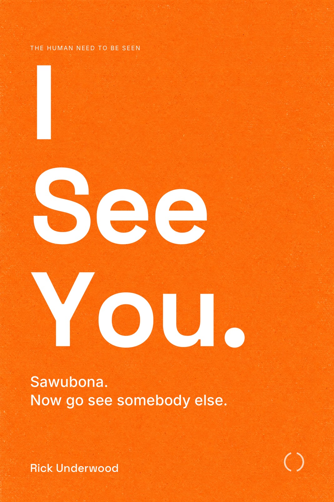
160 px · Amazon grid
96 px · one inch
13Across everything · Now Go
Interior
15d. Sawubona, the end page: orange arrives only on the imperative
Orange appears five times in the whole interior: the 5% numeral at 06:127, two typographic pages, the Part Four opener ring, and the phrase Five percent better. This direction makes the cover the sixth. Everything inside stays exactly as rationed.
Merch
The send-off IS the front print. No orange tee was generated; the orange field stays on the cover and the merch carries the words. The log: the piece people would actually buy at a talk.
Connection
The 5% challenge.
One ask, one week: try 5% more to see one person. The newsletter opens it, the mug and the tee are the reminder, and the reply is one line about who it was. It never becomes a score, and the copy never says we already have 95% of what we need.
Built on: the planned Kit newsletter and store; the 5% ask from Bible section 3.
Where it fails
It spends the brand's one reserved colour on the front, so if orange ever appears anywhere else on the package the rule is dead. Orange is also the worst colour on press: no clean CMYK match, it goes brick or mustard without a spot-colour conversation.
14Direction 10 of 10 · Concept 08
08
Five Percent
Frankl austerity. A field 95% empty and a blue band that is exactly 5% of the cover.
Carries
The 5% ask. Try 5% more. Never the 95/5 inventory, which is a different point and must never be fused with this.
Ground White (re-composited today; the render was cream)Orange The period only
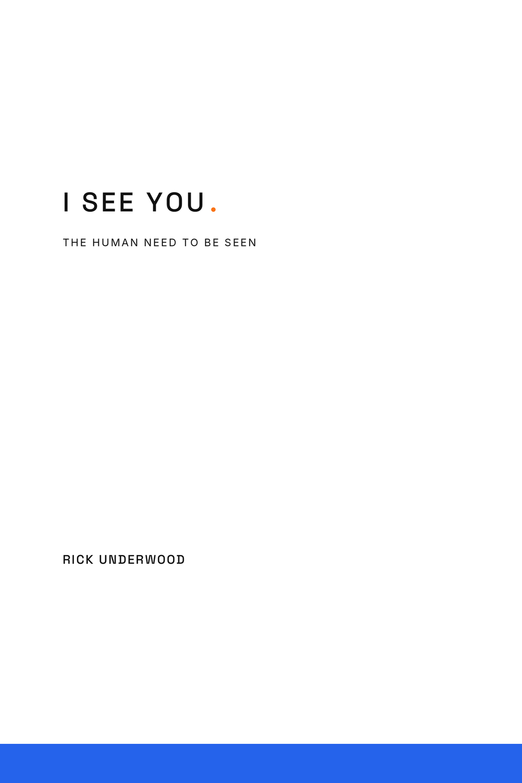
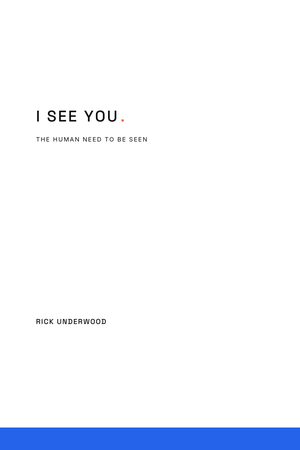
160 px · Amazon grid
96 px · one inch
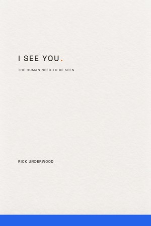
This morning, cream
14Across everything · Five Percent
Interior
15a. 95 and 5, charcoal and white by hard rule
The 95 and 5 figure in Chapter 15 is the closest interior relative, and it is deliberately never orange, because colour would fuse the material-abundance point with the ask. The band idea survives best on the part openers and the back cover.
Merch
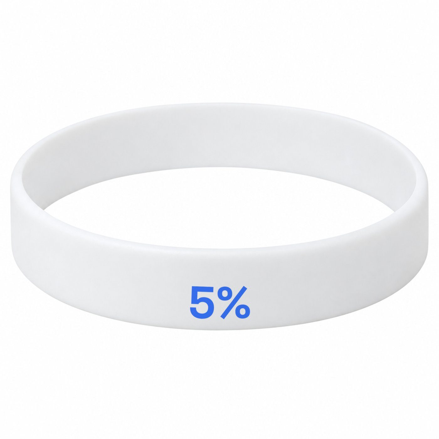
A tiny tracked title and a hem band read as a plain tee with a stripe. The 5% wristband is the better carrier.
Connection
The wristband and the ask.
The 5% band is the practice made wearable. It goes out with the book order, and the only copy near it ever says 5% more. The newsletter's first issue explains the band, so it is never just a stripe.
Built on: the tagline sheet's wristband placement; the planned store.
Where it fails
It vanishes at one inch and reads as a university press monograph. Handicapped by the missing Light weight. The provenance trap is real: any copy near it says 5% more, never 95/5.
14Build your own cover
Ten art layers, three grounds, three title settings.
Compose the one you would pick up, then save it to your vote.
This screen is interactive and needs JavaScript. The ten directions above read without it.
15The interior art program as a whole
A serious literary book that happens to think in pictures a handful of times.
Ink on paper: one illustrator's hand in charcoal and brush for seven scene plates, one line weight for every diagram, so the whole book reads as one voice the way Rick's prose does. Blue means one thing only, the seeing, and appears only where seeing is present in the text. Orange appears in exactly five places in the whole book. Every diagram is built from one shape, a circle, which is the iris, the wound-loop, the ripple and the duality halves depending on where the reader is. The reader learns the grammar without being told.
The three handles, one circle in three states
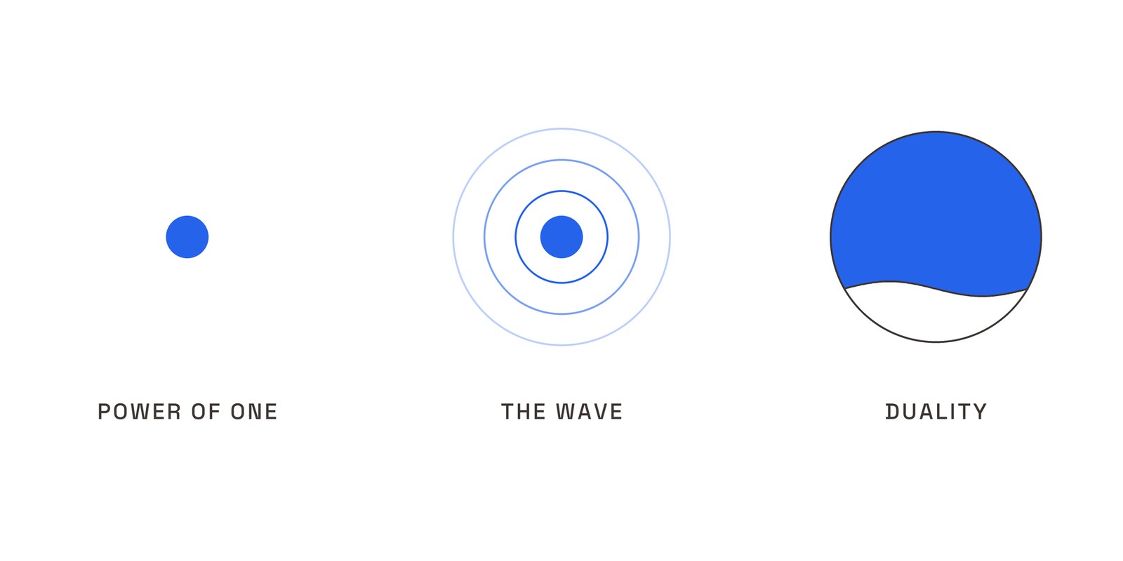
The ten heroes, rendered today
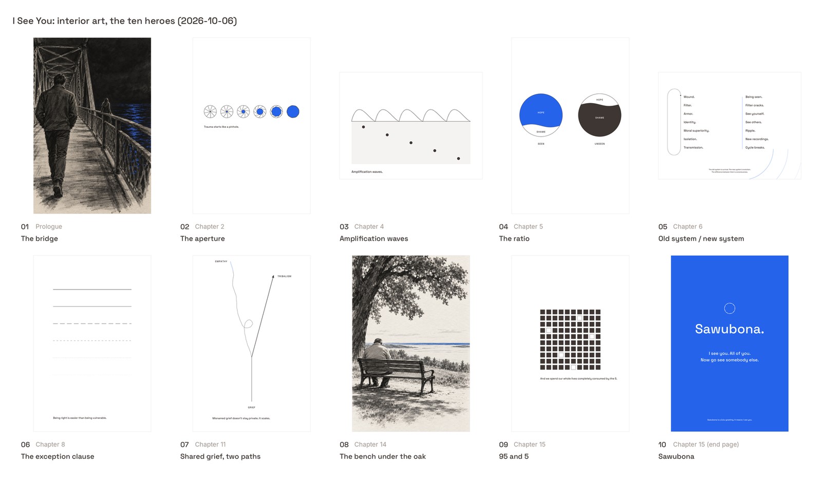
Four paid generations (the bridge three times, the bench once). Every figure is code. Hero 04, the ratio, re-rendered today with #111111 in place of the warm charcoal that read brown.
The chapter-mark iris: closed at the Prologue, one stop per chapter, solid at the Epilogue

15The interior art program · all 31 pieces
7 plates
13 figures · 10 type pages · 1 archival
5
Homes for orange in the whole book
| # | Where | Piece | Type |
|---|
| P1 | Prologue | The bridge Hero | Plate |
| 1a | Ch 1 | Three groups in one house | Plate |
| 1b | Ch 1 | Four folded apology notes | Archival |
| 2a | Ch 2 | The aperture Hero | Figure |
| 3a | Ch 3 | One signal, two filters | Figure |
| 3b | Ch 3 | You don't have to disappear for me to be real. | Type page |
| 4a | Ch 4 | Amplification waves Hero | Figure |
| 4b | Ch 4 | Grief isn't just death. | Type page |
| 5a | Ch 5 | The ratio Hero | Figure |
| 5b | Ch 5 | The floor and the narrow band | Figure |
| 6a | Ch 6 | The human crane | Plate |
| 6b | Ch 6 | The trust equation (resolves the 06:71 placeholder) | Type page |
| 6c | Ch 6 | Old operating system / new operating system Hero | Figure |
| 7a | Ch 7 | The 1% | Figure |
| 7b | Ch 7 | You're not defending an opinion. | Type page |
| 8a | Ch 8 | The exception clause Hero | Figure |
| # | Where | Piece | Type |
|---|
| 8b | Ch 8 | Moral superiority is how the unseen become unseen to each other. | Type page |
| 9a | Ch 9 | The people we call heroes. | Type page |
| 10a | Ch 10 | The mirror that gets bigger | Figure |
| 10b | Ch 10 | Does this send me back into the world? | Type page |
| 11a | Ch 11 | Shared grief, two paths Hero | Figure |
| 11b | Ch 11 | The cavalry isn't coming. (orange) | Type page |
| 12a | Ch 12 | The letter setting and Rick's handwritten R. | Plate |
| 12b | Ch 12 | The bridge, from the railing | Plate |
| 13a | Ch 13 | The curve that turns | Figure |
| 14a | Ch 14 | The bench under the oak Hero | Plate |
| 14b | Ch 14 | Three hours: 2:32 and 5:16 | Figure |
| 15a | Ch 15 | 95 and 5 Hero | Figure |
| 15b | Ch 15 | Just five percent. That's the ask. (orange) | Type page |
| 15c | Epilogue | Cooper's head in the lap | Plate |
| 15d | Epilogue | Sawubona (end page) Hero | Type page |
Finding for the editor
The manuscript still prints a bracketed placeholder at 06:71, [FIGURE: equation of being-seen vs. blinding-others, to be designed]. Piece 6b resolves it with the trust equation the next four paragraphs walk through, credited to Maister, Green and Galford. Until then the compile gate should fail on it.
17The connection layer
Book, quiz, letter, practice.
The merch is the token of the practice.
PrintBook
Two QR pages are specified in the art map: Letters to the Unseen closes Part Three; the assessment page is the last printed page. Pure black codes, hairline boxes, a redirect Rick controls.
BuiltQuiz
How Seen Do You Feel. Local prototype, three tiers (adult, teen, preteen), one JSON contract driving the questions, the message and the analysis.
BuiltLetter
Each reader gets a personalised letter through a gate, with a PDF template. Letters to the Unseen holds Rick's authored letters behind the QR code; one is written, its safe-messaging read pending.
ProposedPractice
A Kit newsletter and a direct-to-reader store. Each issue closes with the practice: go see somebody. The 5% ask lives here, never as a score.
2027Archive
The Living Book: the manuscript, the audio, the letters, and an anonymised archive of reader letters by cohort. Blueprint written, deferred.
How each direction plugs in
The Period
The letter arrives as one line and a period.
Constructive Interference
The wave, drawn from reader responses.
Railing
The bridge as a place and a practice.
Two Arcs
The mark becomes the thing people send each other.
Three Degrees
Name one person you saw this week.
Shiboka
Letters to the Unseen.
The Mirror
A result you hold up.
Both True
A two-truths prompt card.
Five Percent
The wristband and the ask.
18Our recommendation
Take three to the next round.
1 The Period
The brief's first choice and the brand sheet made into a cover. Correct at every size and on every surface without a compromise. Next pass: the one-line title variant, a real paper stock, a printed proof.
2 Two Arcs
The brief ranked it fourth on the crowded-lane worry. The render argues it up to first: single sumi-e strokes, gaps top and bottom, the title inside the opening, the most recognisable of the ten at one inch, and the strongest merch on the sheet. It locks the mark, the cover and the garment into one object.
3 Railing
The only cover with narrative pull, a real photograph of the real place the book opens. The Greenlights move. The type still fights the railing and it is the smallest title at one inch; a two-line setting would fix both. It needs your explicit yes first.
Held, not dropped. Constructive Interference stays the brief's number two on the idea and drops only on scale: the line nearly vanishes at one inch. A heavier brush or a taller wave band and it is back in. Shiboka is the black-ground alternate if Railing does not get the yes. The Mirror waits for a hardcover.
The trade-off. The quiet literary covers (Period, Two Arcs, Interference, Shiboka) buy the Frankl register and keep the orange rule intact. The movement cover (Now Go) is the loudest thing on the shelf and the right use of orange, but it spends the brand's one reserved colour on the front. Our read: keep the front quiet and let the send-off be loud on everything the reader wears and carries. The movement lives on the back of the tee and the mug, not the jacket.
19Decisions for Rick, and what we did today
Seven things need your gut, not ours.
The markOpen Aperture, dual colour, recommended in March. Geometric, organic, or hand-drawn? Two Arcs puts the hand-painted answer on the table.
White or blackNo concept uses a flat blue field on purpose. The white covers (Period, Two Arcs, Interference) versus the black ones (Railing, Shiboka, Mirror).
Orange on the frontThe October 6 rule (orange is the call to action only) versus the March mark (blue arc plus orange arc). Both True, Two Arcs and Now Go need the ruling.
Subtitle on or offPeriod, Five Percent and Now Go work better without it. Railing, Interference and Three Degrees want it.
TrimAll ten are set at 6 x 9. At 5.5 x 8.5 the proportions hold but the type and the 5% band rescale.
The railingRailing is the only cover with narrative pull, and a bridge railing can read as the thing it is. It needs your explicit yes, not a default.
Which blue, which orangeThe March guide's first two questions are still open. Every render here uses #2563EB and #F97316 as shown; CMYK soft proofs come before any print approval.
What we did today
10
Cover art generations
9 base + 1 retry
4
Interior plates
bridge x3, bench x1
21 paid generations in total, every one through OpenAI GPT Image 2.5 on the Creative Studio route released 2026-10-01, high quality, no text generated by any model. Every word and mark on every cover, figure and garment was composited in code with Space Grotesk and Inter. Figures and the iris system are pure code. Two fixes made in code today: cover 08 recomposited on pure white, and hero 04 re-rendered with #111111.

The two proof-of-pipeline renders from this morning, before any direction was briefed: the compositor test and the smoke test.
Not done, by design: CMYK soft proofs of the two brand colours, printed proofs at trim, and the QUOTE-LEDGER row for any manuscript line that lands on a cover surface. All three precede print, none precede this review.
20Combinations
Mix them.
A cover from one, an interior from another, the merch from a third.
The ten were built to be judged whole, but the parts travel. Build up to three combinations; name them if you like. Your picks come first in each row, the rest stay open.
This screen is interactive and needs JavaScript. The ten directions above read without it.
21Cast your vote
Everything you picked, in one place.
This screen is interactive and needs JavaScript. The ten directions above read without it.
22What everyone picked
The room, so far.
This screen is interactive and needs JavaScript. The ten directions above read without it.
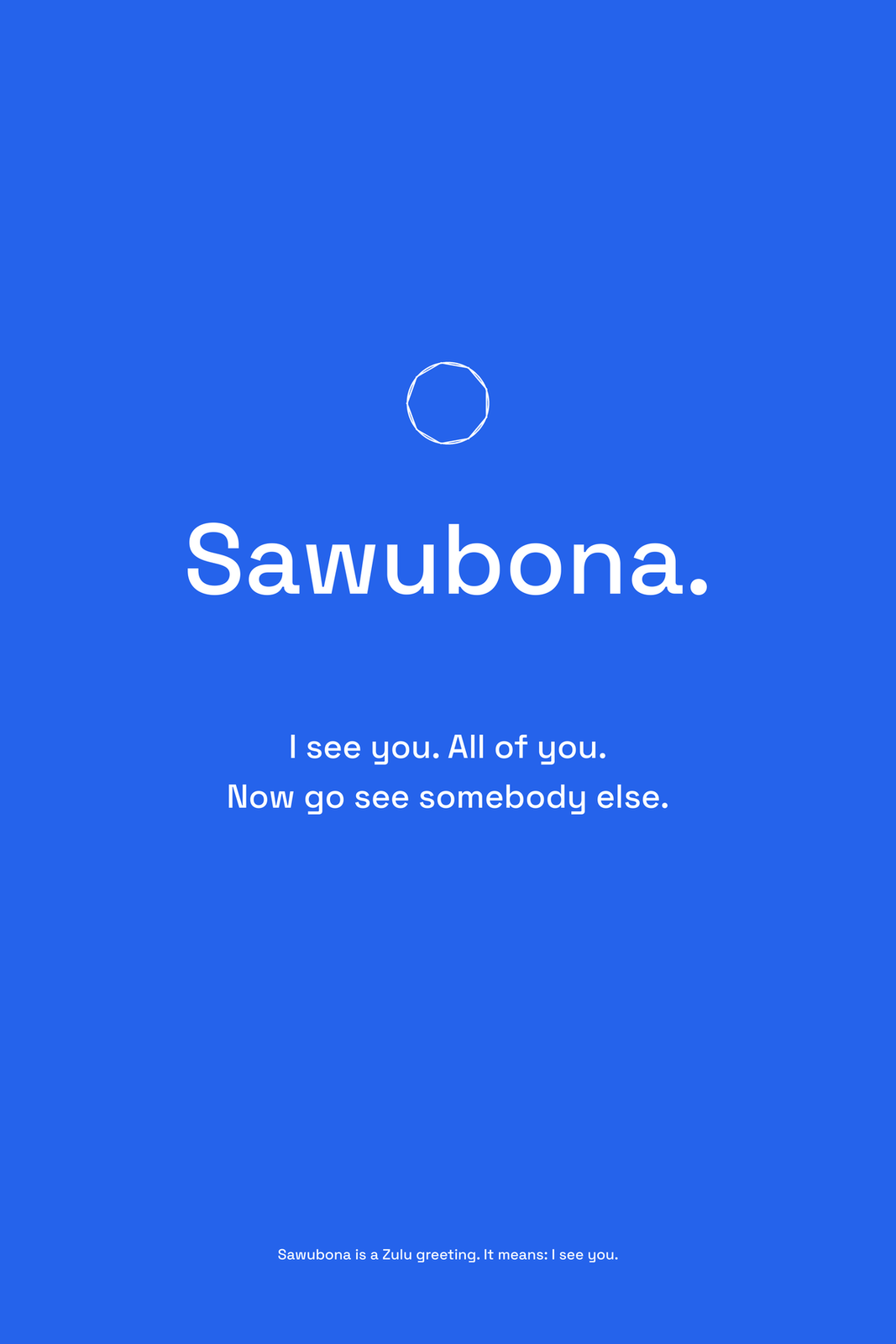
Sawubona.
I see you. All of you.
Now go see somebody else.
I See You: The Human Need to Be Seen · Rick UnderwoodBrand Directions Rev 2 · 2026-10-07